
Visual Merchandising Techniques and Guidelines
When creating retail spaces, there is a range of different visual merchandising techniques that brands use to ensure that their stores are equipped to generate sales. From movement and repetition to proportion and variety, visual merchandisers must work to incorporate a number of elements to provide shopping environments that deliver.
One of the most important things that visual merchandisers need to consider is the idea of unity. Within the context of VM and retail design, unity refers to a state in which stores have overall aesthetic coherence and communicate a clear theme throughout. This sense of unity, though, should be established with the careful balance of different techniques to create shopping environments that are visually exciting, ultra-functional and unique enough to make a lasting impact on customers.
When working with high-street brands and retail design consultants, we have found that the majority of successful visual merchandising projects have this overarching theme towards which all of a store’s graphics, product displays, signage, lighting systems and colour schemes point.
…the most successful visual merchandising projects enhance the effectiveness of the core theme with a narrative because, as psychologists have proven, customers find it much easier to relate to creative concepts when they are given a back story.”
This theme can be inspired by anything that’s culturally relevant or of interest to a brand’s target market, for example, it could be influenced by traditional seasonality, sporting events or public holidays. However, the most successful visual merchandising projects have enhanced the effectiveness of the core theme with a narrative because, as psychologists have proven, customers find it much easier to relate to creative concepts if they’re given a back story.
Think of the rise in story-based Christmas campaigns from the likes of John Lewis, Coca-Cola and Aldi…these aren’t actually direct promotions of the products themselves but emotionally-charged narratives that tap into the aspirations and beliefs of viewers by selling non-tangible ideas. Each of these adverts is reinforced and supported by visual merchandising techniques in-store that provide customers with a visual representation of the story, alongside relevant product displays. Ultimately, stories help provide a bigger picture for customers and give retailers the opportunity to cross-sell products.
Store Layout
The path that a customer will take upon entering your store needs to be physically mapped out. This will allow you to utilise a range of visual merchandising techniques that draw customers through the store from the entrance to the payment areas and increase the chances of them making a purchase.
One of the most crucial visual merchandising guidelines when it comes to the layout of stores is visibility. The majority of customers expect to find everything they’re shopping for on one floor, therefore stairs, lifts and escalators pose a threat to converting customers, unless the products on each floor are communicated effectively.
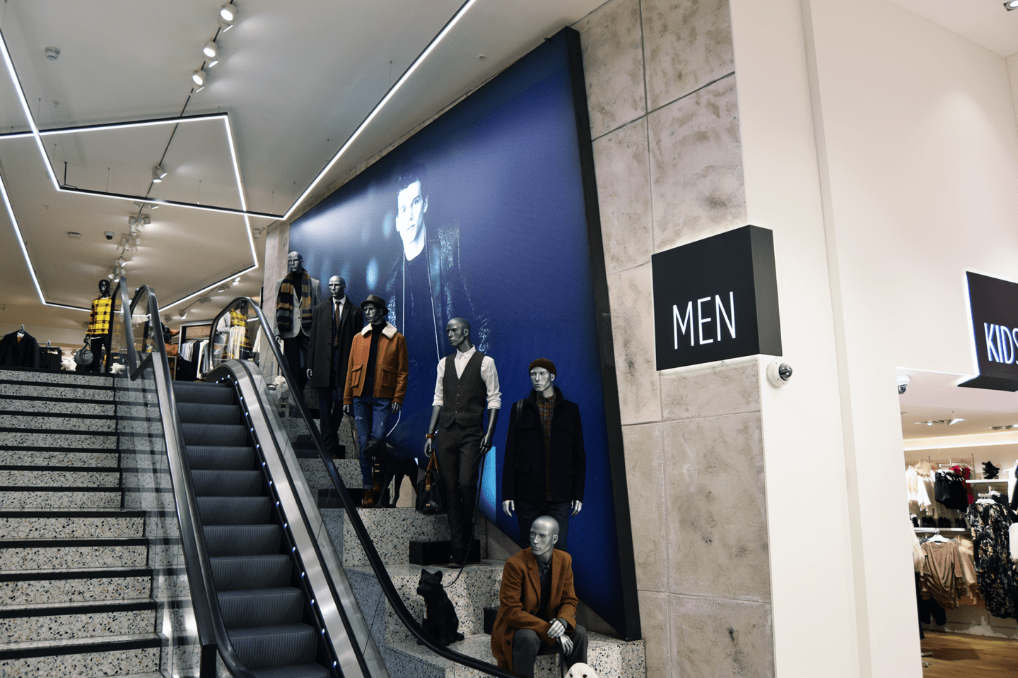
Take the example of River Island, as shown above. We worked with its visual merchandising team to engineer graphic displays with a mirrored effect to draw attention to the floor plan whilst clearly communicating to customers exactly what they should expect to find on the floor above. They also chose to install custom-shaped light-boxes to utilise the wall space adjacent to stairs and escalators as a site for additional graphic displays merchandising to customers whilst they were using stairs & escalators. With dressed mannequins positioned tactically in front of the lightbox displays, the store’s designers were able to achieve a visually exciting environment and create up-selling opportunities for when customers reached the menswear section upstairs. Learn more about graphic displays here.
Your store layout and mapped customer journey will be based on assumptions of how the majority of people will flow through your store. Generally, data shows that people tend to move to the right of obstacles they meet upon entering the store journey. If this journey is considered alongside the focal points of your product displays, you can then implement display techniques to draw the customers attention.
LED lightboxes and illuminated signage are ideal for drawing customers to highlighted sections of your store. George at ASDA implemented neon-style LED signage to catch the attention of shoppers and draw them deeper into the clothing section, specifically towards denim for the launch of their new tailored-fit ranges. As this was mounted to the top of the existing shopfitting system and included brightness, full-colour lighting, it was highly visible throughout the store.
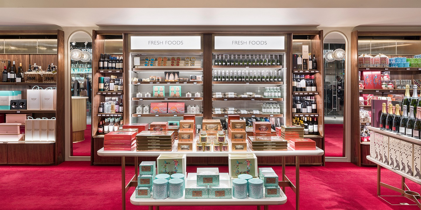
Retail Display Structures
Wall-mounted displays
Traditionally, wall displays are broken up into three key sections, each of which performs a specific visual merchandising function. The top third of the display is used for visibility and drawing attention, the middle for feature product displays, and the bottom for additional stock options, such as different sizes, fits and colours.
However, we’ve seen a different approach being taken recently, most noticeably by Clarks in their new store concept. Clarks has a large number of products to display and, historically, shelving systems have consumed the majority of the available retail space in its stores. The footwear retailer has, however, changed its approach to visual merchandising more recently, specifically towards how the perimeter walls of its high-street stores are merchandised. Using our Kontakt shelving system, Clarks provided each shoe with its own movable illuminated shelf, all of which were framed by a graphic lightbox with LED illumination to maximise visibility. This brings the focus of the customer’s eye onto the middle of the display, immediately highlighting product options.
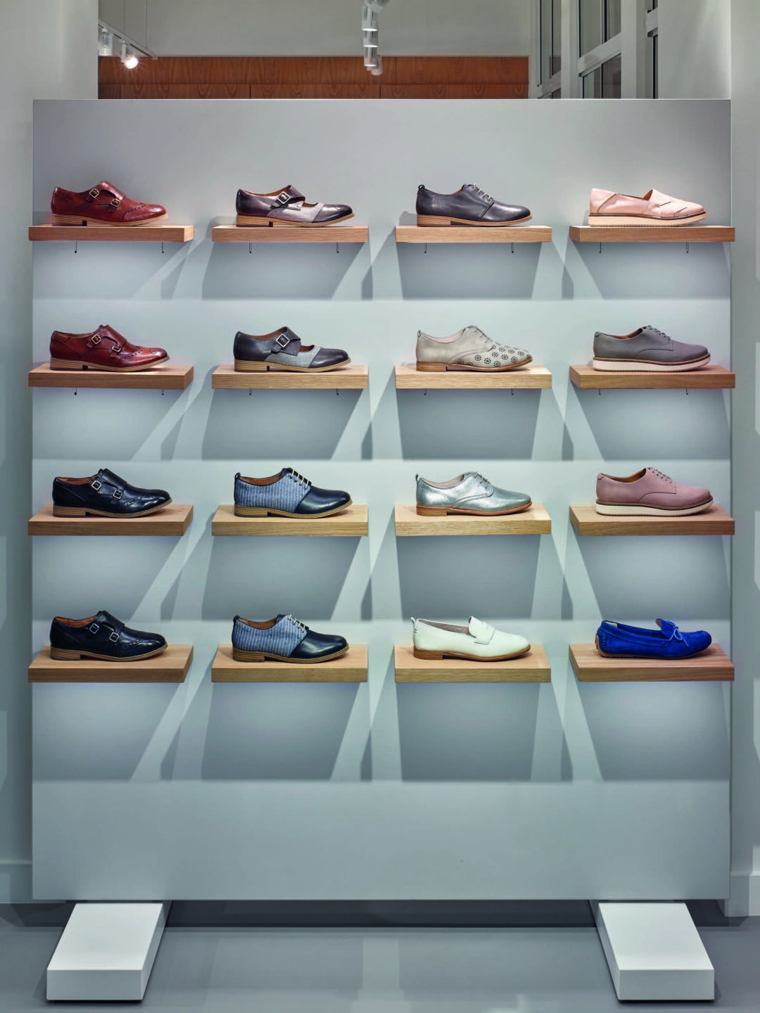
This approach was also used as a cross-selling opportunity for mid-floor units, with a custom attachment allowing other complementary products such as handbags and accessories to be hung directly alongside the shoe displays. Learn more about the benefits of Kontakt shelving systems here.
Ultimately, the most important thing to consider when specifying wall-mounted displays is the efficacy with which they will grab and hold the attention of shoppers. This is usually done by using contrasting lighting fixtures to create visually complex displays that punctuate a space and catch the eyes of customers.
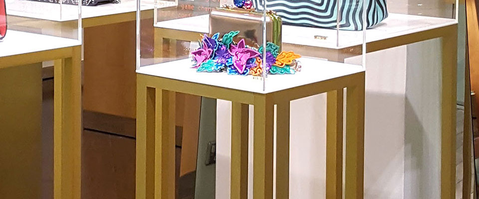
Mid-floor displays
Mid-floor displays should match the style of the wall-mounted displays to provide continuity between the different visual merchandising techniques used within a store. For example, we recently worked with Selfridges to create standalone mid-floor displays that highlighted high-value items as visitors move through the store without appearing inconsistent with the overall aesthetic of the space. This is an ideal application of podium-style display structures as they are used within an area of the store that is dedicated to low stock density and high-value items. Learn more about custom retail display systems here.
If you would like advice on how to create visual merchandising systems that are optimised to perform according to the needs of your customers and the commercial objectives of your business, get in touch with our team by phoning 0161 655 2100 or by emailing [email protected].
Browse our full range of retail solutions here.


 White on Black")

