Exhibition Stand Design Ideas
Our Exhibition Stand Design Ideas Blog contains the latest ideas, trends, and innovations in the exhibition & event industry.
We’ve collated some of the most inspiring projects we’ve seen, highlighting the companies that created them as well as the potential applications they could have for your own exhibition stand displays. These range from modular exhibition stands, to lighting designs and interesting uses of materials. We want our exhibition stand ideas blog to be as useful as possible, so if you have any feedback or would like to let us know about a project please feel free to get in touch. If you’re looking for more interior design inspiration, see our Retail Design Blog.
Jump to a specific month:
2019: January February March April May June July
2018: January February March April May June July August September October November December
2017: January February March April May June July August September October November December
2016: June July August September October November December
February 2020
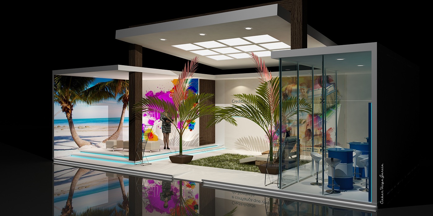
This exhibition stand by Resinorte is a great example of how using vibrant colours and light can draw attention from visitors to your stand. Resinorte’s stand effectively takes advantage of the space in their stand to encourage visitors to walk into the stand.

This exhibition stand by Dulux is instantly recognisable to those familiar with their brand and walking by this exhibition stand. Using a giant colour palette is rather effective in grabbing the attention of visitors with LED lights to highlight the sculpture of colours displayed.
December 2019
This exhibition stand is unique to any other, using a minimalist and innovative design on the outside with only LED lights to guide the visitor into the stand to fully experience it once entering. This is a clever way to attract and intrigue visitors to your stand.
November 2019
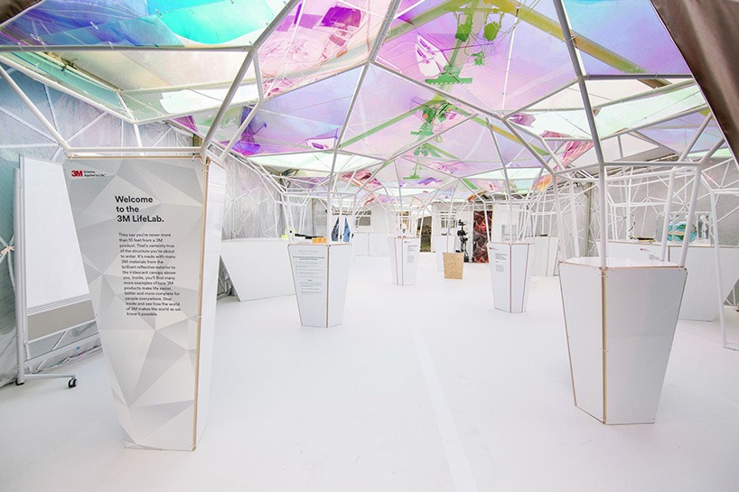
This exhibition stand for the SXSW event in 2015 by SOFTlab, 3M and BBDO is minimalist yet effective in creating an elegant and modern design created through soft lights and abstract shapes to entice visitors into walking around and experiencing their exhibition stand themselves.
Source: https://www.designboom.com/architecture/3m-lifelab-softlab-sxsw-03-26-2015/
October 2019
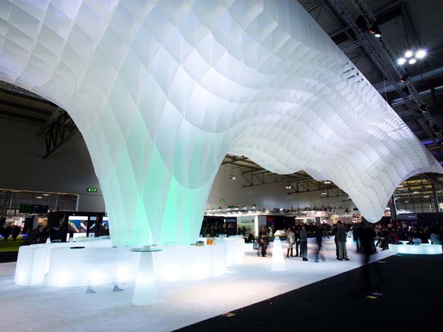
This exhibition stand by MIDO shown at a trade fair in Milan was made up of 2200 pieces of paper and with the additional help of lights, this sculpture creates a unique glacier effect that would surely leave visitors to the stand amazed.
Source: https://www.frameweb.com/article/mido-fair-stand
September 2019
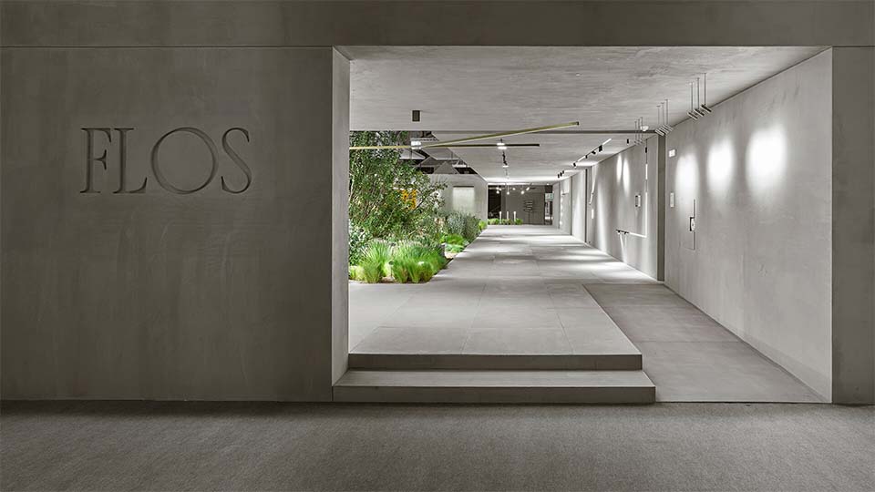
This modern and unique exhibition stand by Flos at the light and building fair in Germany effectively brings light to darkness with the use of contrasting lights and colours to display their products. This exhibition stand is sure to grab the attention of visitors.
Source: https://www.frameweb.com/article/why-flos-is-greying-out-all-the-surfaces-in-its-stand
August 2019
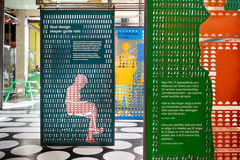
Vestre folk + form’s exhibition stand has effectively used textures and an array of colours to create attraction at their exhibition stand, letting visitors walk around and experience it first hand.
July 2019
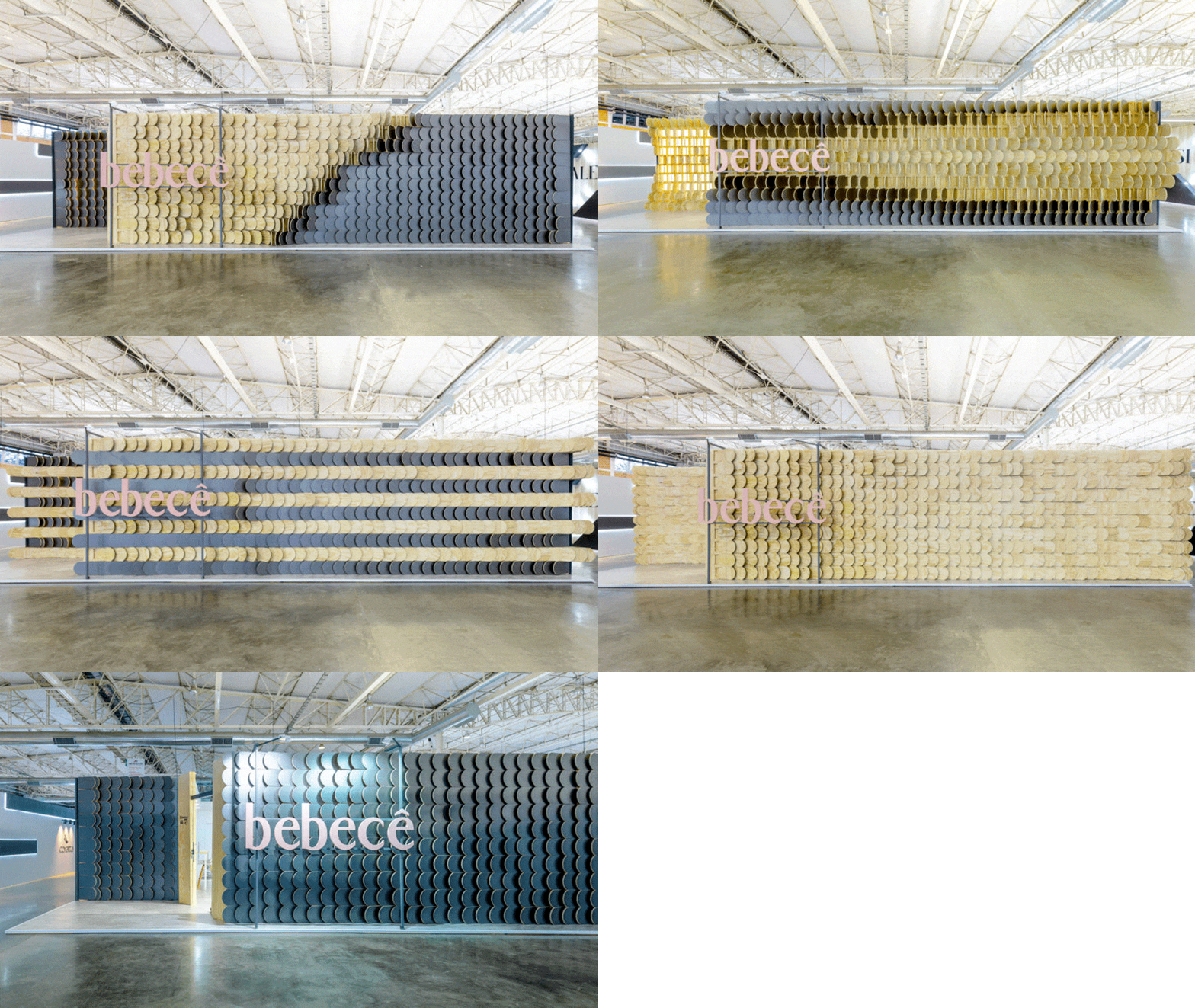
It’s not often that we see something completely original, however, this idea from Bebece is nothing short of incredible.
With a stand walling made of movable wooden boards, not only can the stand be refreshed constantly throughout the day, the exhibitors can choose when to ‘open’ the stand-up, and when to keep the boards closed – particularly useful when the stand is busy with potential clients.
And of course, it goes without saying, visitor engagement is a huge benefit of a design like this.
June 2019
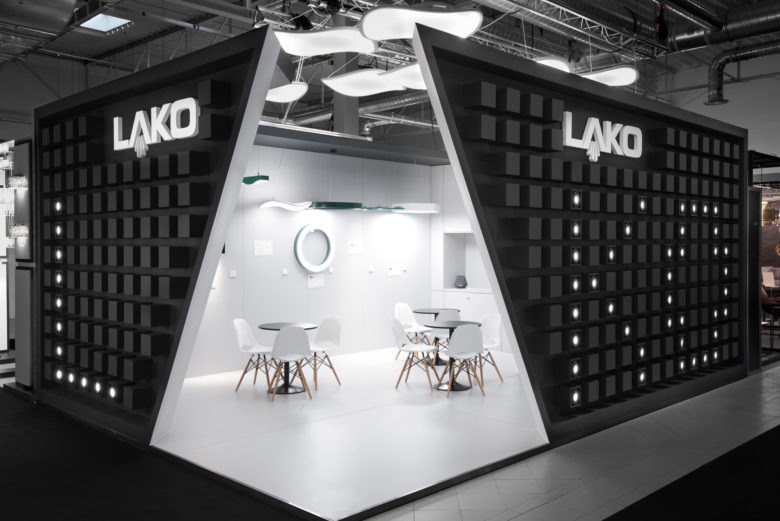
Lako’s design is simple but incredibly effective. Committing to the monochrome palette to this extent is rarely seen (for a range of reasons – not least sourcing everything you need for an exhibition stand in matte white!), but we’re sure you’ll agree, this application is sure to engage visitors.
We particularly like the subtle nod to the brand on the outside of the stand, with pixel-like LED dots combining with the angled opening to the stand.
May 2019
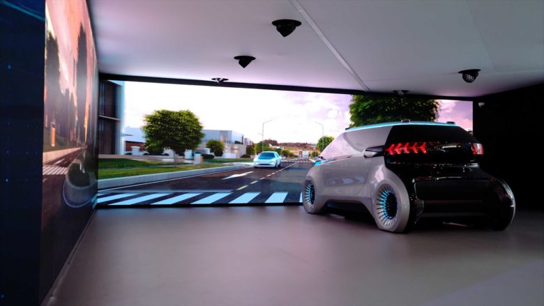
This Hyundai Mobis exhibition installation is simple, contemporary and completely uncluttered; perfect for showcasing the vehicle itself. With aspirations of being a leading light in the field of future car technology, the focus of this installation is the car itself. The stage itself offers a very bold shape and design with a roof that gives the illusion it is collapsing.
The roof design and the clever use of colour on the floor draw both the eye and the visitor into the booth.
The design itself appears deceptively simple, but on closer look, each part is integral to the overall look. The focus, as it should be, is on the vehicle itself, but this is certainly enhanced by its surroundings. The monochrome colour palette is once again in evidence; there really is no need for other colours which would clutter up this modern, clean look.
April 2019
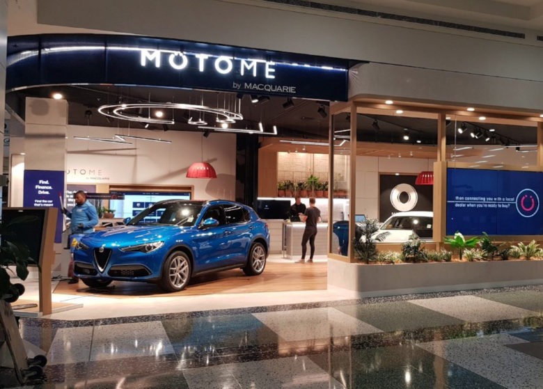
This Motome by Macquarie in Hornsby has been designed to mimic the traditional car showroom. From the large windows to the external planters, the desks and wooden flooring of this exhibition space have been designed to be familiar but with all the flexibility of an exhibition format. Multiple brands of cars can be exhibited on a rota basis due to the open sides, which allow easy access. A kinetic retail display forms an integral part of the stand and allows the customer to compare and configure a number of different cars in order to enhance their decision-making process by giving them all the information they need in one place.
Technology is at the heart of this design with an interactive platform to help customers with every aspect of buying a new car. Research played a considerable part in the development of this design; customers were asked what they were looking for when purchasing a vehicle.
March 2019
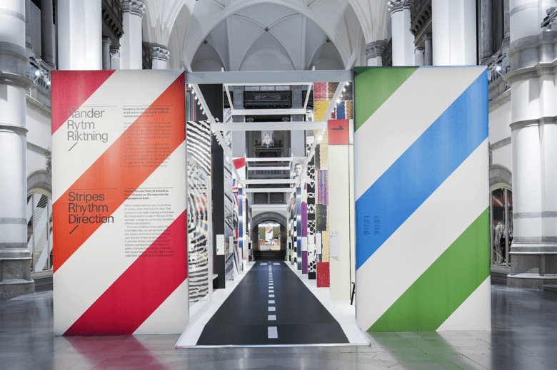
The Nordiska Museet (Nordic Museum) in Stockholm is the largest museum in Sweden, the building itself is an impressive one, and the grand hall with its glorious high ceilings a room that could all to easily overshadow the contents. This is simply not the case with this thoroughly contemporary exhibition that was put together back in 2013. The exhibition needed to be something utterly modern in an effort to draw a younger audience into the museum.
Bright coloured, bold stripes and patterns form clean, modern lines to create a real visual contrast with the museum building as a backdrop. The typeface used for all the wording is also clean and modern. The central “road” pathway draws the eye down the line of exhibition panels and towards the end of the hall. Small spotlights are strategically placed at the top of the panels to create a perfect amount of lighting.
February 2019
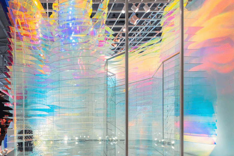
A walk-in paradise exhibition installation in Beijing is a visual feast for the eyes. The designer was asked to bring the metaphysical symbolism of an “auspicious cloud” to life, in a way that gave the client a result that was less corporate and more emotional. And, this has undoubtedly been achieved. The 35-metre square site uses acrylic plates with shimmering covers and polished steel to create a reflective floor that captures the reflections of those who walk within the installation. Refracted coloured light is bounced off the plates to create a somewhat ethereal space.
Colours are created by the clever use of surfaces, reflections and light rather than being a complete part of the overall design. Fluidic shapes offer a stunning contrast from one part of the installation to the other for an altogether soft look. There is something almost mesmerising about the whole installation; quite what the company offer is unclear and it simply doesn’t matter – this is an exhibition stand anyone would want to visit.
January 2019
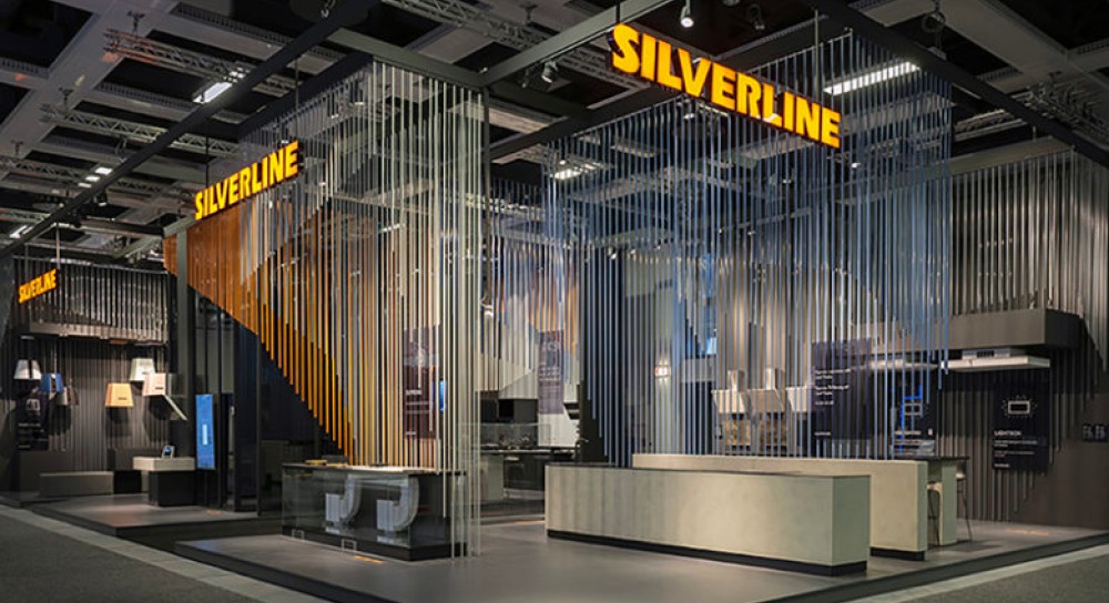
Silverline have created an incredible dramatic exhibition stand, through the use of space and depth in the colours being used.
Choosing two colours that contrast perfectly, alongside tones that match the aesthetic of the stand itself – such as the greys within the countertops and floor panels, provides depth and attracts people to the stand because of the effect it creates.
December 2018
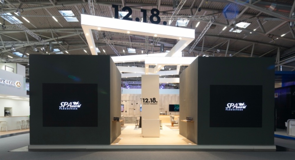
The use of hanging structures on this exhibition stand looks great and is surprisingly easy to recreate. Often exhibitors don’t consider the space they have above their stand, but it can provide valuable returns in the form of visibility and awareness.
In this example, a simple modular structure could have been hung from the ceiling with an interlocking aluminium composite panel surround, where the LEDs sit within the structure. This results in a lightweight structure that is incredibly effective.
November 2018
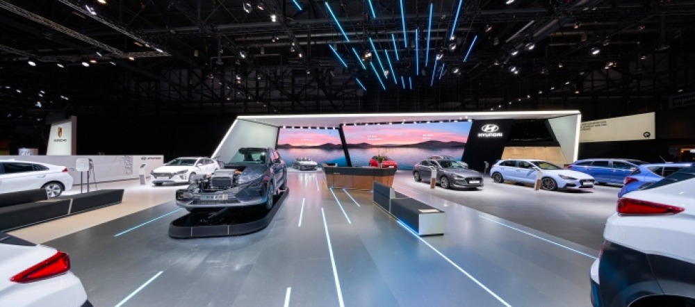
Hyundai’s stand at the Geneva International Motor Show looks incredible, thanks to some cleverly positioned linear lighting.
Showing that simple ideas can be effective, different sized lengths of linear light is laid into the floor giving the perception of movement, which coupled with a brilliant backdrop of moving water (something our Kinetik lightbox is great at producing!) creates an immersive stand experience.
October 2018
Redpoint – Panorama Berlin Winter 2018
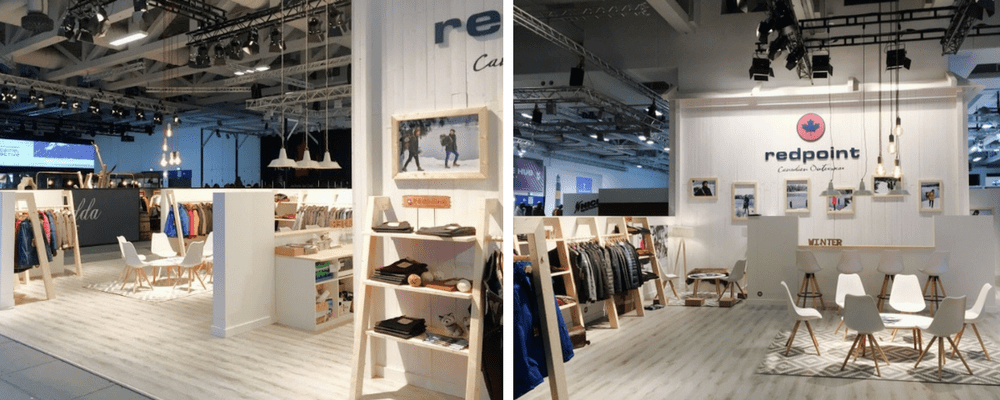
After years of being with the same designer, Canadian outerwear brand Redpoint decided to try something new and teamed up with Sinneswelten Interior to create a pop-up store at Panorama Berlin Winter 2018.
Inspired by the brand’s Canadian roots the store encapsulates elements of Canada’s impressive landscapes to create log cabin style settings.
September 2018
Montblanc – SIHH 2018
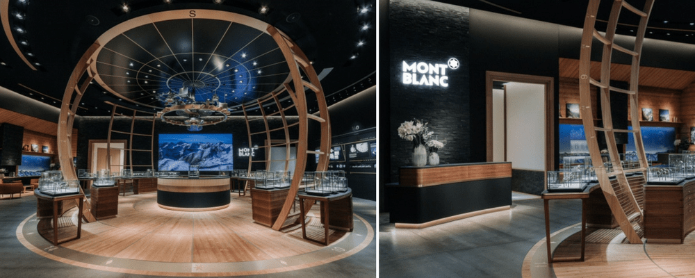
Designed by Studio Jean-Marc Gady, Montblanc’s booth at SIHH 2018 (The trade show for the world’s major watch brands) created an immersive experience that told the story of watchmaking and shared with guests the inspiration behind their latest 2018 collections.
A spherical wooden cage structure houses their latest collections and in the centre of this space, watchmakers are at work demonstrating the craftsmanship and knowledge that goes into each watch.
August 2018
Food Truck Festival – Oslo International Airport
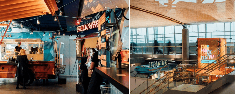
Based in Oslo International Airport, The Food Truck Festival creates a colourful urban environment that offers something different than your average airport food court.
Created by SmartDesign Group in partnership with HMSHost the bright and eye-catching colours, furniture and trucks create an inviting outdoor atmosphere in a busy airport setting.
July 2018
MINI – Montaña en la Luna installation
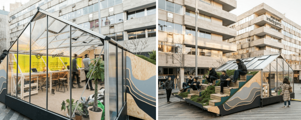
MINI teamed up with Enorme Studio to create an outdoor installation located in Plaza Santa María Soledad Torres Acosta, Madrid.
Created to be a meeting point for design, the space features USB charging points, solar-powered reading points as well as outdoor and indoor seating spaces.
June 2018
Finsbury’s office space by BDG architecture + design
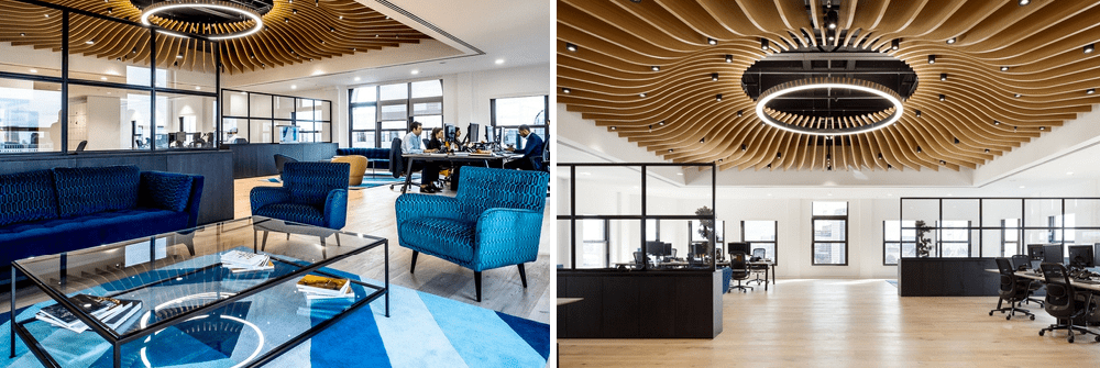
Although strictly not an exhibition space, Finsbury’s new office space by BDG architecture + design shows how effective partitioning can be to add depth to a space.
With a slim black framework featuring large glass panels separating key sections, enclosed spaces are created without the sense of being boxed in. For exhibitions, this could be a key design feature for visitors who may be apprehensive when approaching stands.
May 2018
Schüller Möbelwerk’s stand by Dart
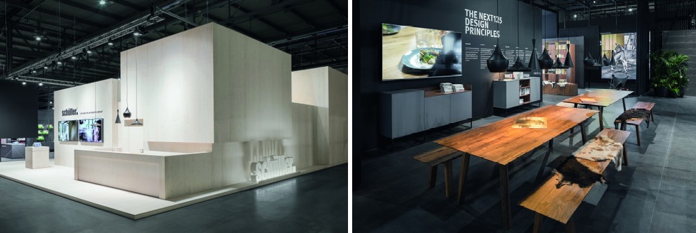
Schüller Möbelwerk’s stand by Dart is a tale of two halves. Whilst the outside provides an intriguing natural finish, with areas such as the logo providing an eye-catching element, the inside provides a refined experience.
With matte black finishes to the walls, seemingly untreated flooring and highly polished tables, a luxury space is created.
April 2018
The Store stand at showUP
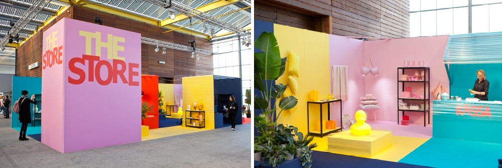
If there’s one thing you could say about The Store’s stand at showUP, it’s that you definitely can’t miss it! Their approach to colour shows how effective a simple approach can be.
Although each section integrates products and display equipment, due to the matching colours throughout, each area is clearly defined and creates a ‘stand out’ space.
March 2018
Durstone & Q stand – Cervisama 2018
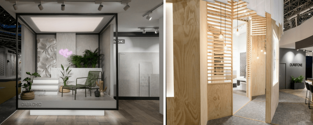
Designed by VXLAB for brands Durstone and Q, their stand at Cervisama 2018 combined two ceramic brands into one space.
Durstone’s space was characterized by black on white colour schemes, elevated platforms, lightboxes and clean lines. We really like the use of lightboxes throughout the space.
Q’s space took its inspiration from Japan. Featuring simple shapes, pinewood, fabric and copper to overall create a light environment that contrasts with the black on white colours of Durstone’s space.
February 2018
Audi – Digital Points Installation
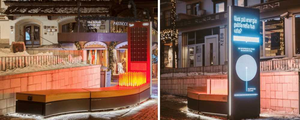
Installed across Cortina D’ampezzo, Italy and designed by architecture studio POINT, Audi’s Digital Points Installation promote an eco-friendly lifestyle.
The installation features digital islands which give real-time updates on noise pollution, green energy production, street safety and climate conditions to connect urban life with interactive design.
The islands also feature heated seats, free wi-fi, USB recharge points and we think it’s a great example of digital elements being cleverly used to bring functionality to everyday life.
January 2018
Adidas Originals ‘SNKR exhibition and pop-up store’
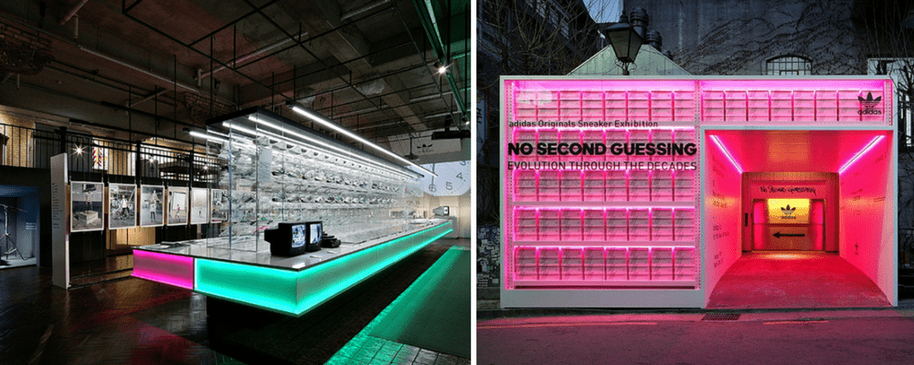
Adidas Originals ‘SNKR exhibition and pop-up store’ explores the history of the brand’s EQT line.
Designed by Urbantainer, the exhibition features exposed concrete, rough textures, graffiti signage and neon lighting which give the space an old school street style aesthetic. The exhibition takes place across multiple rooms which explore the brand and the EQT lines design, history and style.
We really like the clever use of lighting across the exhibition space and especially like the neon lighting used in the entrance to the exhibit. Find out more about our LED alternative to neon here.
Gucci – Gucci Garden
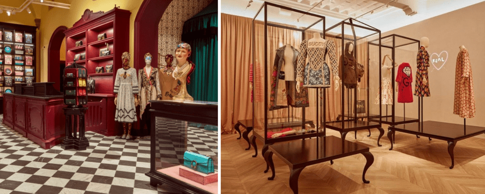
The newly curated Gucci Garden, formally known as the Gucci Museo reopened in Florence, Italy at the start of 2018.
Serving as a museum and gift shop, the space is dedicated to the brand’s history and combines glamour, high fashion and interactivity in one place.
Within the space there are several themed rooms and visitors to Gucci Garden are able to go shopping, dining and watch a film thanks to the boutique, gift shop, restaurant and cinema that feature across the space.
Novoceram – Cersaie 2017
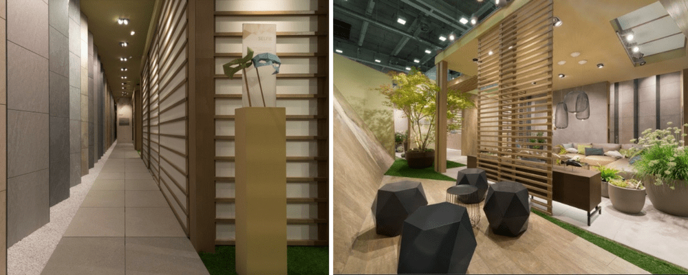
French ceramic manufacturer Novoceram based their stand at Cersaie 2017 on the ancient Japanese art of Origami.
The stand entitled ‘Origami Booth’ encapsulates the purity and zen associated with Japanese living whilst presenting Novocerams’ range of ceramics as part of the stand’s unique natural environment.
December 2017
MINI LIVING by Penda
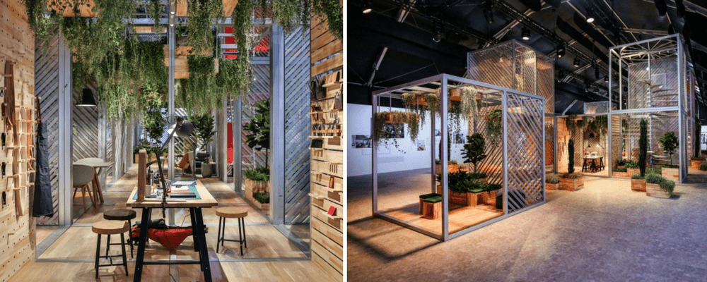
Created by Penda, MINI LIVINGS ‘Urban Nest’ small living concept exhibited at the Shanghai Mini Life Exposition. Constructed from a series of 3 by 3 modular shapes, each module houses different elements that when combined create a range of versatile living arrangements.
The series of modular shapes are created using recyclable metal and on each roof urban plants feature. The whole stand resonates with Pendas’ values of creating buildings and spaces that connect with the environment and embrace nature.
Expedit Stand – Euroshop 2017
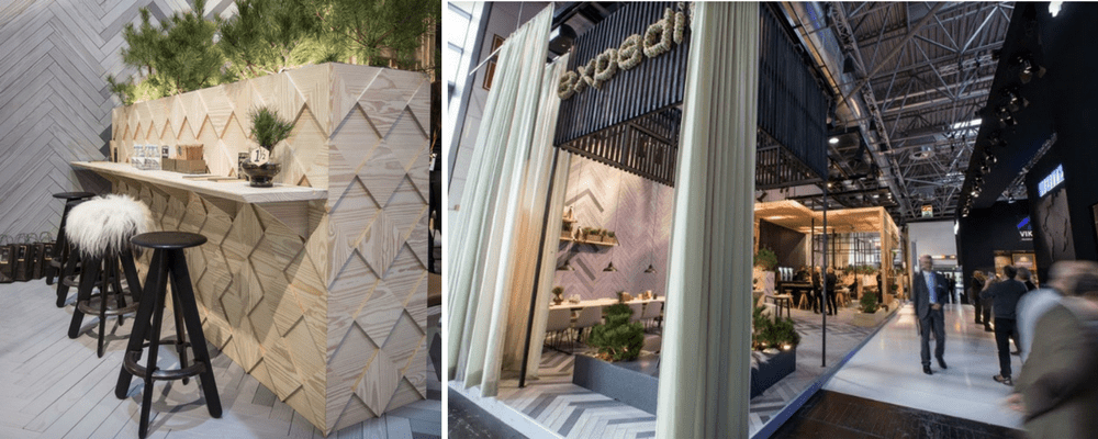
Expedits Stand at Euroshop 2017 was based around the theme ‘Nordic by Nature’. Designed to encompass Expedits identity with its Nordic heritage and pioneering design.
The stand cleverly combines both modern and natural elements to create an aesthetically pleasing display that features natural colours and materials such as wood, stone and metal.
Dongpeng stand design by VXLAB
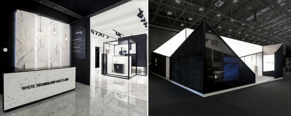
China-based ceramic tile company Dongpeng made a statement at Cersaie 2017. This year’s stand, designed by VXLAB combined last year’s ‘‘The Nature of Light’ concept with their new ‘The Future is Polymorphous’ concept.
Throughout the stand geometric shapes and bright white lighting work with and highlight the Dongpeng’s marble tiles. But we think that the stand out design feature is the bright white lightbox that surrounds the front of the stand. Find out more about exhibition lightboxes here.
November 2017
Yo’Hood trade-fair stand – China
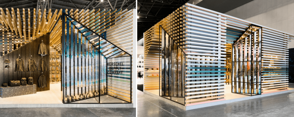
The Yo’Hood stand was created to showcase Herschel Supply’s Canadian background in a visually complex way. The stand takes inspiration from log cabins and features a timber frame with mirror-clad columns and timber slats that are painted to depict natural scenes.
The innovative stand displays Herschel Supply’s products but goes beyond that by telling a story of the brand’s background in a creative modern way.
Filling Pieces exhibition – Paris Fashion Week
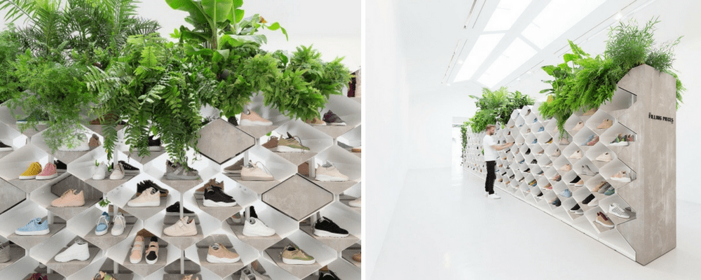
Filling Pieces the Amsterdam based footwear brand created the ‘sneaker landscapes’ exhibition which tied together urban and natural environments.
White modular walls, concrete elements and greenery are featured on the display system which house Filling Pieces’ range of shoes. The natural colours used across the exhibition and the geometric design used created an installation that wouldn’t be out of place in an art gallery.
Niro Ceramic Group – Cersaie 2017
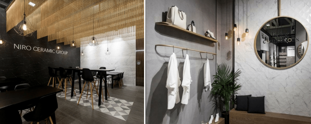
Nicro Ceramic Groups stand at Cersaie 2017 has a minimalist and conservative style. Throughout the space, a monochromatic colour scheme is used to create elegant displays that compliment Niro’s ceramics.
The space is split into two, Zirconio and Nicro ceramics but also features a meeting space and a ceramic library which displays a selection of the company’s most popular products.
October 2017
Brewing Floor experience at the Guinness Storehouse by LOVE
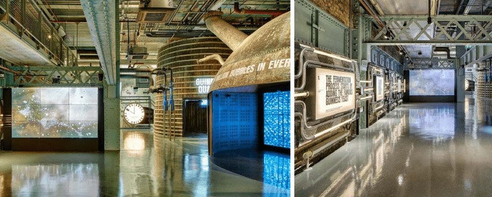
This month’s highlight comes from creative agency LOVE who created the new Brewing Floor experience at the Guinness Storehouse, Dublin.
The exhibition uses space and lighting design alongside interactive experiences to let visitors immerse themselves in the brewing process, ingredients and story behind Guinness Draught.
The lighting, Lightbox style screens and interactive elements used throughout the exhibition create a fully stunning display that brings the brewing process to life.
Unscent ‘Fragrance is who you are’ at Pitti Fragranze Fair 2017
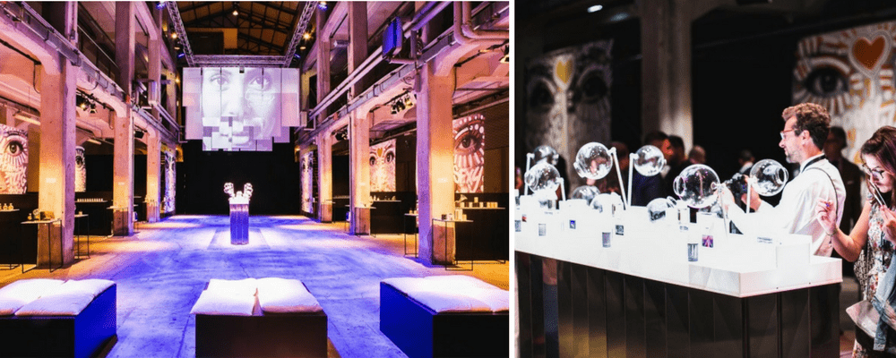
Intertrade created an exceptional artistic installation at Pitti Fragranze fair 2017, Italy. Titled Unscented “Fragrance is who you are”, the installation gave visitors the chance to experience fragrances in a bold, unique way. The installation combined Intertrades’ beauty and fragrances and set them against backdrops of video projections and portraits to create a modern visual experience.
Intertrade used both warm and cool-toned lighting throughout the installation to create a multisensory experience that highlights the importance that fragrance has in our lives.
Lego House by BIG
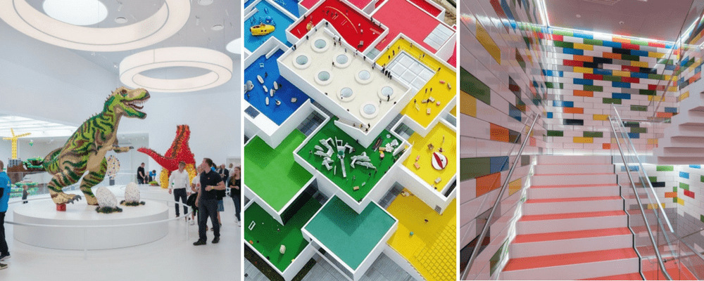
BIG-Bjarke Ingels Group worked with LEGO to bring the classic LEGO brick from a toy scale to an architectural scale. LEGO house is an experience centre for fans of all ages.
Construction of the project began in 2014 and the 12,00 m2 LEGO House contains everything from exhibition spaces and outdoor areas to restaurant concepts and experience zones.
The clever use of bright white lighting illuminates and intensifies the classic LEGO colours, which creates an aesthetic across both the indoor and outdoor spaces.
September 2017
Trésors Quotidiens exhibit at WeWork La Fayette
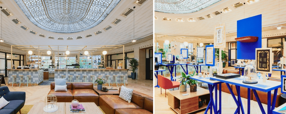
French designer Sam Baron curated an exhibition inside the newly opened, Paris co-working space, WeWork for Maison et Objet 2017. Throughout the space a 1920’s feel manifests, the feel of this iconic era is further amplified through the use of rich metallic finishes and luxurious fabrics that reflect the original structure of the building.
The exhibit Trésors Quotidiens shows a series of physical products in an increasingly digital era. These products enhance the workspace and visitors to the space are provided with a map of Paris, highlighting where each featured object can be purchased.
The modular style displays used throughout the space creates a contemporary look that is currently popular within stores and exhibition spaces.
Spirit of Innovation – BYD booth design by VAVE GmbH
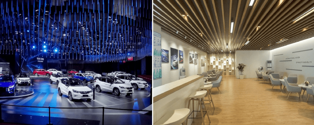
BYD are the market leader for electric cars in China. At the international Automobile exhibition in Shanghai, they exhibited their future-oriented concepts and created an interactive spatial experience for visitors.
The exhibition was split into two sections, lounge and product. The lounge area featured wooden elements, real plants and a coffee bar. The product section featured cool colours, futuristic aesthetics and high-tech exhibits.
The integrated LED lighting used within the lounge space allows for a clean modern feel. Integrating lighting like this further adds to the space within the room.
Stefany’s stand at DOMOTEX 2017 by YERce Architecture
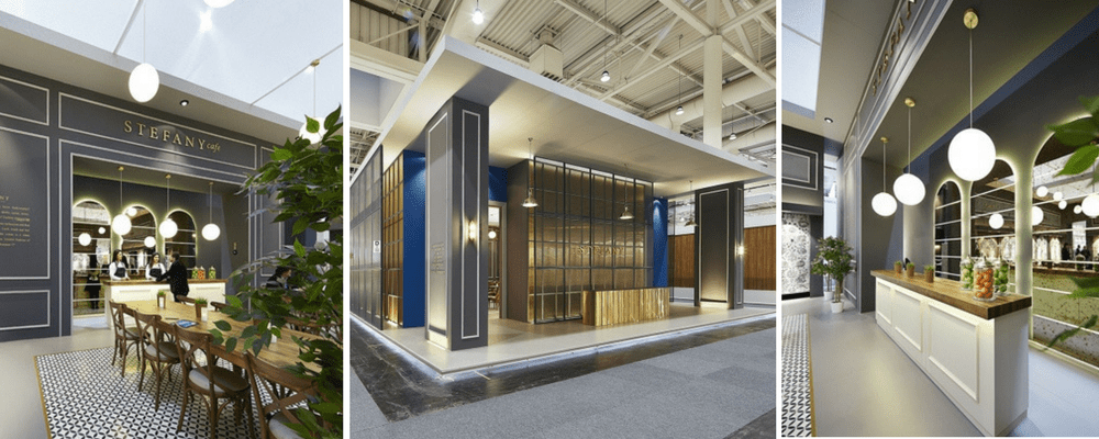
Stefany’s stand brought something different to Domotex 2017; the trade show for carpets and floor coverings. The stand was carefully thought out to make sure the space reflected the identity of the Turkish carpet company and the context of the design.
The exterior walls of the stand created a timelessly elegant feel, beyond these walls sat a cafe. The cafe was designed to provide space for visitors and exhibitors to meet and discuss products.
The interior space created a calming atmosphere that was isolated from the crowds.
August 2017
Deck 5 and KL Druck
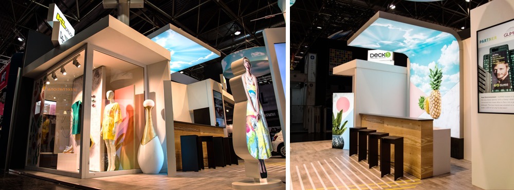
Our highlight of this month’s exhibition stand designs come from Deck 5 and KL Druck, who recently exhibited at EuroShop. Rather than designing something completely bespoke, this stand encompasses a range of standard display features such as LED lightboxes and tension fabric systems but displays them in a truly unique way.
With lightboxes and curved tension fabric systems hung from the ceiling, it’s impossible to miss the stand from afar, however up close – there are also some intricate details that allow this space to stand out. We particularly love the 90 degree curved lightbox that surrounds a seating area.
Tejas Borja
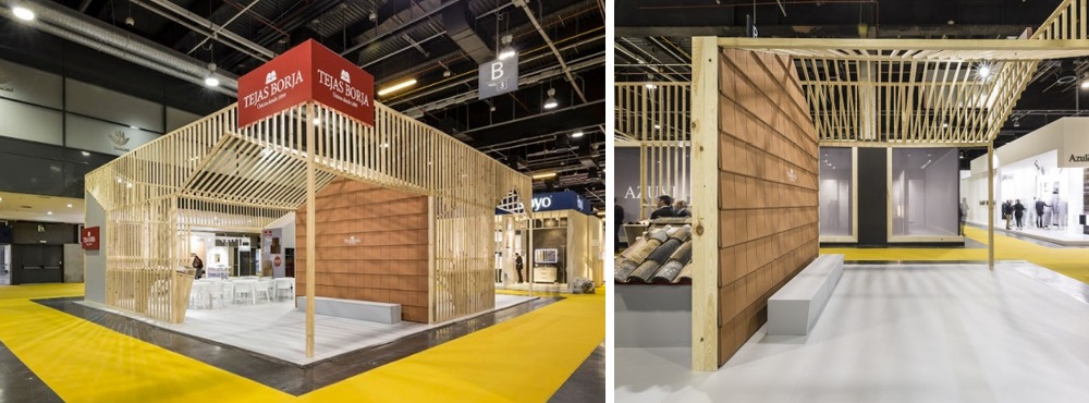
Tejas Borja has created an exhibition stand that, as a result of a clever layout within, makes the stand feel like a closed space at the same time as providing visibility throughout the entire stand.
We’ve seen exhibition stands that have integrated slotted panels and display systems, however, this one is unique because of the way the entrances and graphic displays have been placed. With two entrances on each corner of the stand, the slotted wooden beams have been stepped back and replaced with a solid graphic panel – creating a clear entrance and the interpretation of privacy within.
Jaded

Our final features stand for August takes a creative approach to capture attention. Whilst at Unibox we’re passionate about using advanced lighting techniques, sometimes the most creative approaches can catch the eye.
Here Jaded used standard lighting with hundreds of balloons tied to the top of the structure that gave the stand a blue hue, whilst the beautifully designed seating area drew visitors in.
July 2017
Deutsche Telekom
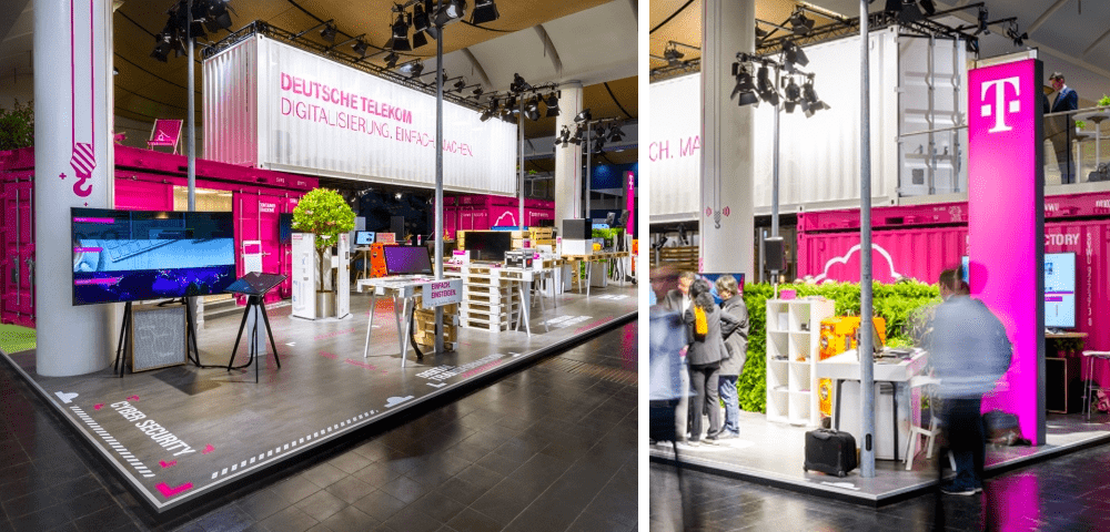
There are two standout features of this exhibition, the first being an excellent implementation of a theme throughout the stand design. The construction-based design theme is apparent on all areas of the stand, from the crates used as exhibition counters and vinyl graphics applied to structural pillars, the whole environment grabs your attention and intrigues visitors towards the stand.
The second is the use of lighting & colour. It can be difficult to stand out in crowded exhibition halls, and the reason this stand achieves that feat so effectively is the use of two main colours, white and fluorescent pink, both of which reflect light well creating a glow around the stand. We’ve found that fluorescent colours are being implemented in multiple sectors, from exhibition to retail – most recently used by SuperDry in their Store of the Future concept, where fluorescent fabrics were combined with LED illuminated light boxes to draw attention to key areas of the store.
Hilton – designed & built by Whaam Concepts
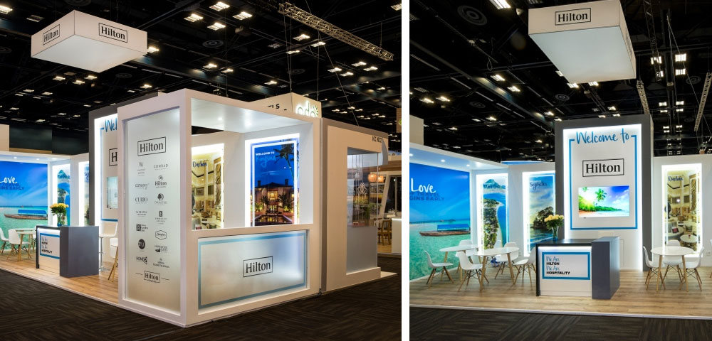
In contrast to Deutsche Telekom’s awareness-building stand design, Hilton was looking to provide a much more discreet area for their potential hospitality clients, demonstrating their brand values of comfort and quality.
Creating meeting spaces within stand design is a challenge, as you’re looking to attract visitors to engage with the stand without creating private surroundings that naturally block visitors’ line of sight. Utilising a central lighting element around Hilton’s logo and a suspended fabric graphic drawing attention above the stand, the use of semi-transparent acrylic walls allowed branding to be placed throughout the exterior of the stand, without compromising privacy once a visitor engages.
Stand designed & built by Whaam Concepts (PTY) Ltd
Case Furniture
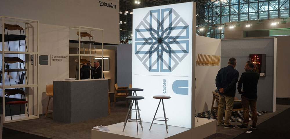
Working with Unibox, London-based furniture designers, Case Furniture, required a number of displays for their upcoming exhibition in New York. With this type of stand design, it’s imperative that the display elements themselves ensure full focus is on the products, simply complementing the products on display.
We helped Case Furniture create a minimal stand space that attracted attention via the large plinth-mounted LED Lightbox, utilising the 25|25 slimline product frameworks to display products alongside a seamless tension fabric feature display creating individual spaces.
June 2017
Pedrali
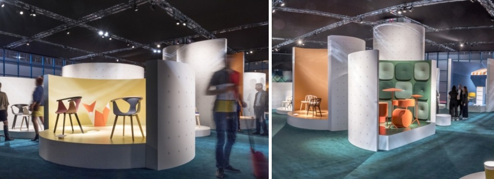
Pedrali launched their new collection at Salone Del Mobile in Milan earlier this year, with brilliant use of their exhibition space. Whilst the space they have available is vast, Pedrali separates each of the new products within their collection and sets each area with its own merchandising & colour schemes, which combined with the platform that the products are raised on, creates an eye-catching, engaging exhibition stand idea.
Keeping the exterior of each pod white ensures the colour doesn’t distract from other displays, whilst in stark contrast, the interior has added texture that intrigues passers-by.
A&B Project
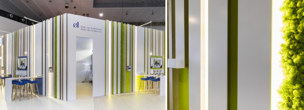
What caught our eye on this stand was the use of lighting, which has been used minimally but the incredible effect. The linear strips add an eye-catching element to the stand, however, it comes into its own when combined with the texture of the inset real moss strips.
We’ve recently collaborated with Innerspace Cheshire – who are specialists in specifying materials for design, such as the real moss strips used here. A&B project has retained the authentic look of the moss here, however, it can be coloured to stay in line with your own brand aesthetic.
Gibam
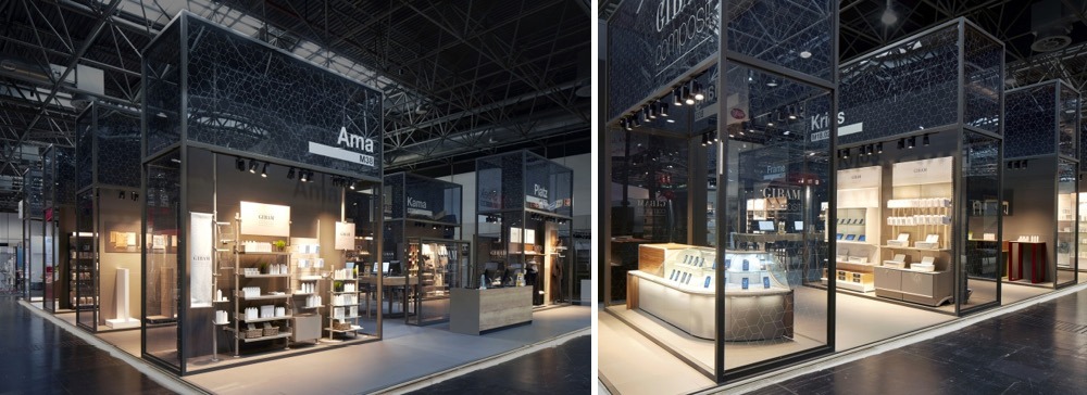
Gibam’s concept was introduced at EuroShop 2017 and looks brilliant. From a design perspective, the first thing you notice is the matte black finish to the frames, which when used on deep profiles such as in this example create a clear frame around product areas.
Combining the black framework and semitransparent graphics above allows the light grain wood displays and focus lighting to take focus, ensuring that although there are multiple product features within the area, each is highlighted with its own light source and visitors aren’t distracted.
May 2017
Effebi
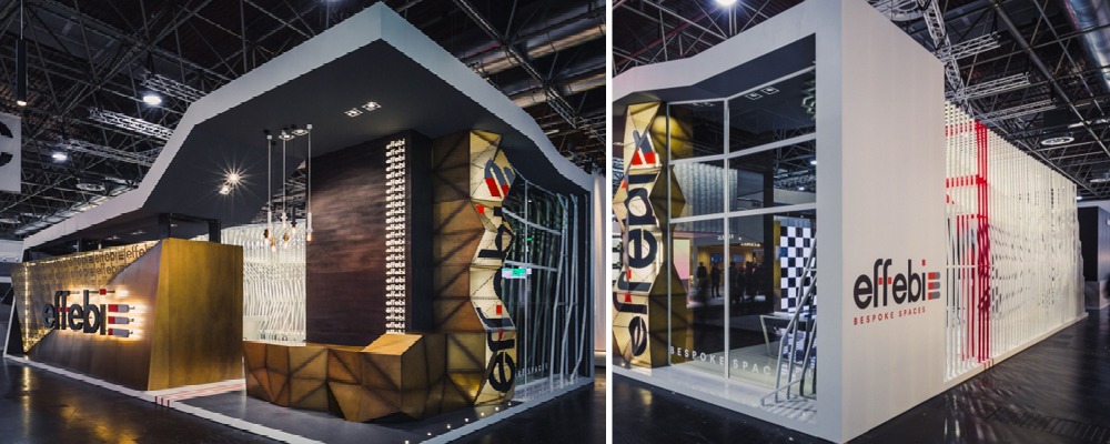
Effebi created a unique space at EuroShop, with their stand seemingly split into a custom build area – featuring beautiful material finishes, and a less structured approach on the reverse – providing an open & inviting feel.
Along the main concourse, Effebi has created a high visibility display, utilising LED signage and integrated branding to brilliant effect, especially where the logo is repeated on the dark grain wooden panel. At the back of the stand, thin wooden pieces have been interlinked to provide both the sense of privacy whilst on the stand, at the same time as creating intrigue to passers-by as they can see into the stand and a subtle change in colour.
sfd.
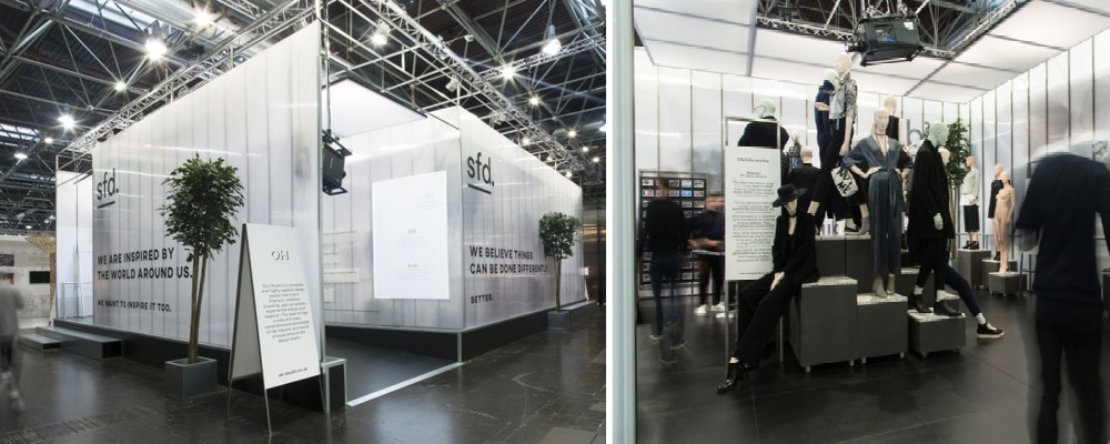
Continuing the sense of intrigue as Effebi did above, SFD created an amazing space at EuroShop. Again, using a material that allows some transparency has created intrigue to visitors outside of the stand, which when combined with the powerful messaging and exterior graphics (we particularly like the use of the projector onto the graphics) results in a stunning space.
The objective of SFD’s stand was brand communication, using technology, lighting and other wayfinding methods to direct visitors to the centre of the stand, where the theatrical approach to design continued with beautifully finished display stands and a monochrome aesthetic creating a clear message for visitors.
AEG
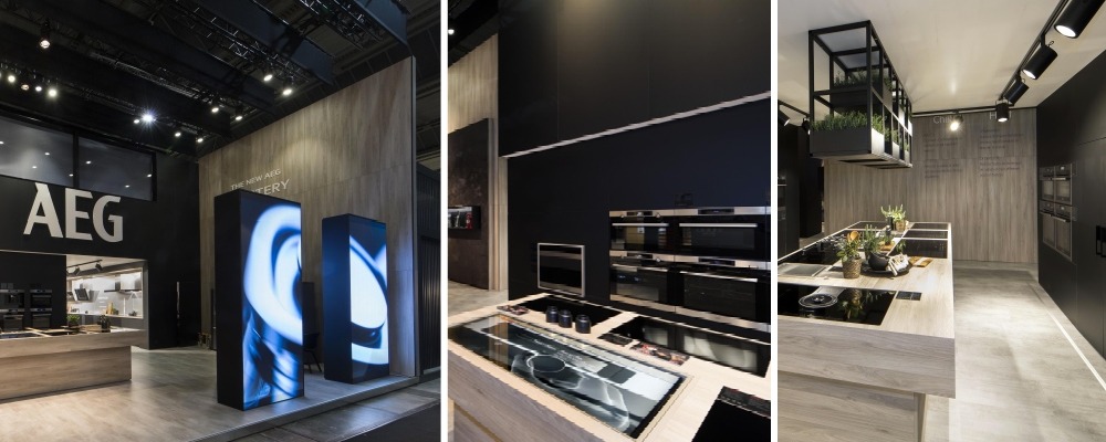
AEG has created a high-quality finish to their space, with their careful use of finishes mixed with animated graphics & technology. Firstly, the finishes used created a homely feel, which is the clear objective of the space as they’re promoting high-end appliances. Lighting has been incorporated as a design feature, matching the matte black finish of the walls and interior frameworks, which look stunning (especially the ceiling-hung display).
However, the stand out element for us is the introduction of animated displays throughout the stand. Moving graphics have been applied to the exterior of the stand on a large scale to attract attention, which is then reinforced once visitors move onto the stand by placing displays alongside featured products, not only attracting them to the product display but also providing the opportunity to educate and subsequently convert the visitor.
April 2017
Gaggenau
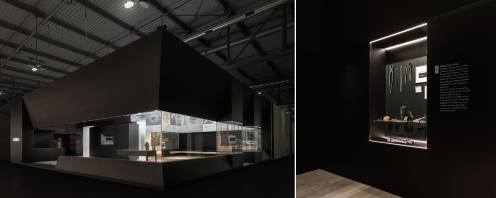
Gaggenau have taken a minimal approach to their stand design, to brilliant effect. The exterior of the stand consists of a single illuminated logo, with the inside of the stand enticing visitors to look further as it’s partially obscured.
The simple way Gaggenau have displayed their products is particularly exciting, as the black theme continues until you reach a recessed point in the wall, which features halo linear lighting and a mirrored back panel. This is a visually stimulating method of creating a full focus on your products, albeit a bold move.
Riga Museum
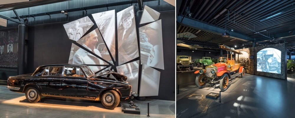
The Riga Motor Museum have used illuminated graphic displays in unconventional (but completely achievable!) ways in their new permanent exhibition. The first display provides context to the cars on display, with a brick-style graphic applied, to which a projection of the car is played. As this is seemingly integrated into the entirety of the display, it’s a great way of drawing attention.
We particularly love how displays of different sizes & angles have been combined to simulate a crash, or a cracked windscreen – again providing context surrounding the car in front of the display, but also an engaging focal point.
Learn more about how to create custom Lightboxes here.
Coordination Asia
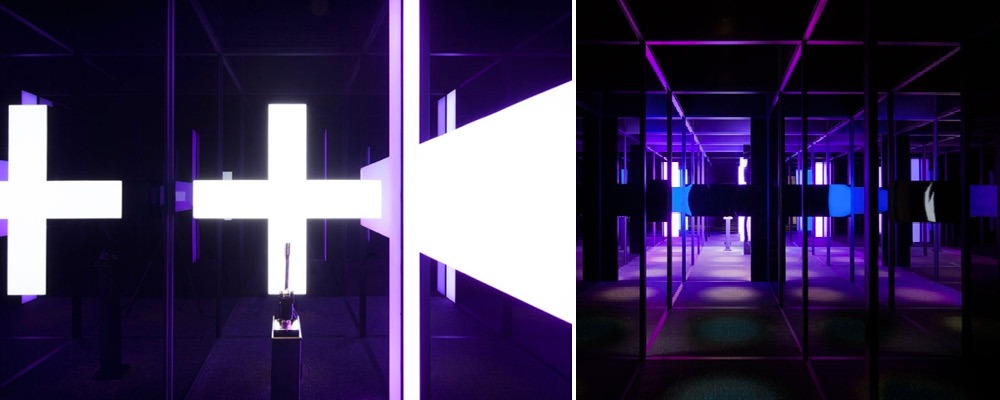
Coordination Asia’s G+Maze display highlights how simple it can be to create beautiful exhibition spaces. Using illumination within the ‘maze’, carefully positioned around a series of mirrors and doorways, it creates a visual trick that brings out the curiosity in visitors. Effects like this can be created on a small & large scale, both looking equally effective whilst potentially providing more visitor engagement.
March 2017
Nike
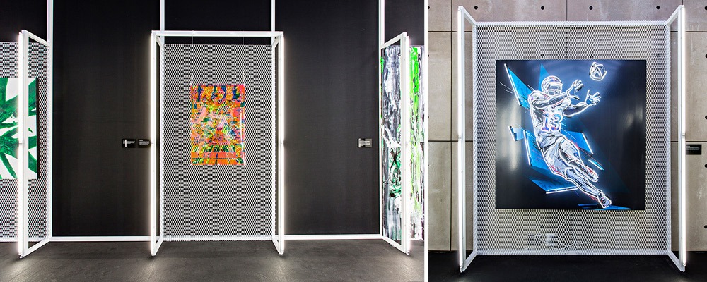
Nike’s design team have once again created a brilliantly simple exhibition space, that perfectly highlights their exhibits. Taking a simple matte white framework, combined with a solid black background, each display is already framed well.
In addition to this, a mess style backing has been applied to create a different texture around each item, which is brilliantly surrounded in vertical strips of neon lighting. Using this type of lighting is a master-stroke, as the glow carries through to the floor as well as the black surrounds, creating individual pockets of light for each display.
The V&A Foil Installation
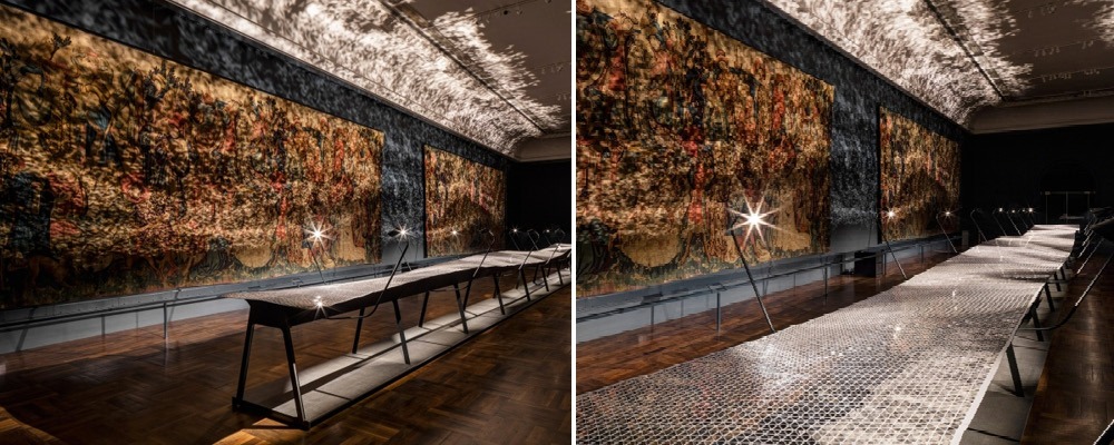
The V&A’s medieval tapestries have had a new texture transmitted to them, through the installation of 50,000 foil triangles as part of Benjamin Hubert’s display.
Using mechanical arms, the foil ripples smoothly, with the light that shines directly onto the foil from above being projected in brilliant patterns across the artwork.
This serves as a reminder that common materials can be used intelligently to add new, eye-catching dimensions to exhibition displays.
Patternity
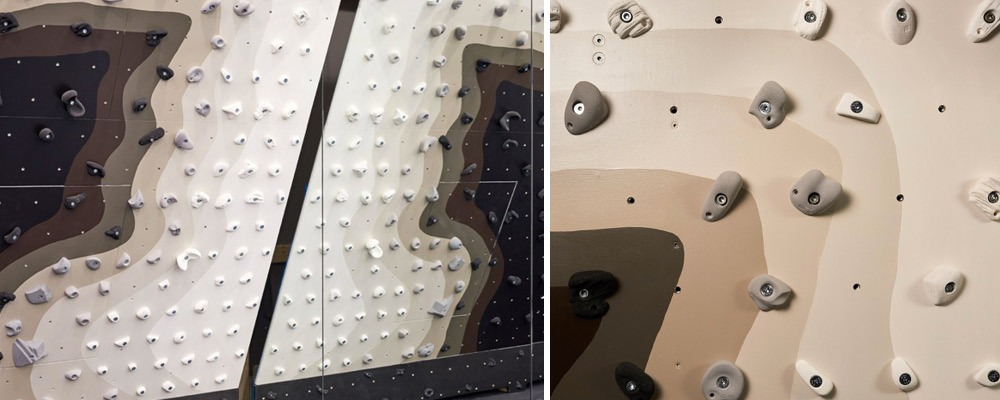
Created as part of London Design Week, Patternity has created a graphic climbing wall for London’s Ace Hotel. A climbing wall isn’t something we thought we’d cover as part of an exhibition design blog, but the attraction has generated a lot of attention due to the new graphic design applied to a relatively well-known piece of sports equipment.
We’re not sure how many of the visitors were ready to climb the wall itself, but this is an effortlessly cool way of creating a buzz around an exhibition space, and generating interaction in the form of participation & social sharing.
February 2017
Dalziel & Pow

Dalziel & Pow have designed an exhibition in the Houses of Parliament, supporting the Newline Charity. The design of this space is particularly arresting because of the initially simple concept of displaying much-needed equipment for children by the charity, taped off by police-cordon style strips.
The message behind this stand is easily transmitted with the materials on display, which is a testament to the design itself. Using this style of tape is particularly clever, as it’s viewed by the general public in very limited instances, wrapping the framework in this branded version clearly catches the eye.
Coca-Cola

Coca-cola has created an experiential space that takes a very simple concept, that’s instantly recognisable and applies this concept to the whole space.
The centre-piece of this display is a seven-meter wide, golden finished bar, with ‘bubbles’ rising from the centre. Using generative parameter software, the bubbles were made out of more than five hundred translucent acrylic spheres that simulated the physical behaviour of sparkling bubbles. The visual effect of movement is enhanced by a lightning system programmed to react to different events that the space will hold, such as concerts and sports games.
Enercon

Enercon represent what can be created when working with large-scale budgets, but although the space is huge, the company clearly have an objective, that is the focal point of the entire stand.
This objective is meeting space. Without sacrificing on design, Enercon has created a two-tier space that has meeting areas in abundance, whilst creating privacy that is much needed in a location like this.
When combined with the overall look & feel of the stand, which is clean and instantly ties in with Enercon’s branding, this is a high impact, conversion-driven exhibition space that we can all take a message from – to remain focused on our objective when exhibiting, and design around this.
Massana School of Art & Design
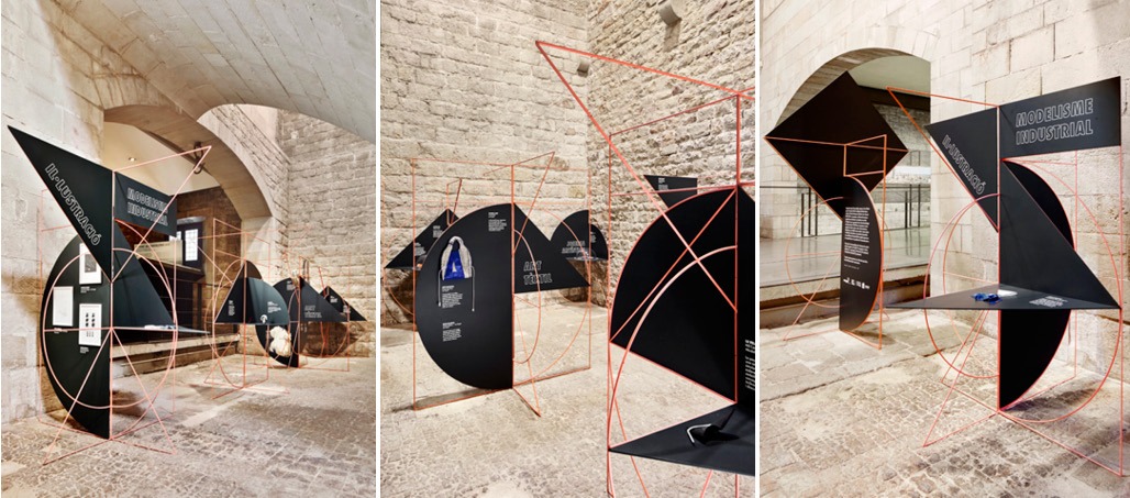
We love this modular display system created by the Massana School of Art & Design. The supporting framework has been created with different shapes integrated into the metal itself, which allows a huge range of configurations to be created when the panels are joined together.
The most obvious application is symmetrical shapes, however, it’s when a variety of different shapes are combined that this system truly comes to life. Simple printed panels can be mounted onto the system which brings the displays to life, highlighting certain products or creating shelving displays.
This system shows that signage & artwork doesn’t need to cover all areas of an exhibition stand, sometimes creating smaller displays with interesting shapes integrated into the framework can be equally eye-catching.
Paul Smith

Paul Smith has developed an exhibition, aptly named ‘hello, my name is paul smith’, which was first displayed at the London Design Museum, and is currently touring the world.
With these latest images coming from the Japan leg of the tour, we see how simple displays can have a brilliant effect when displaying new products or increasing brand awareness. The first display we’re drawn to is the classic Paul Smith coloured Mini, on a matching plinth.
The timeline display which has been wall-mounted and secured behind glass is another great example of story-telling in an exhibition space, with the pieces carefully curated to ensure visitors get a feel for the history of Paul Smith’s designs, without an overbearing amount of information.
Sony
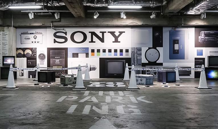
In a more temporary-looking environment, Sony celebrated their 70th anniversary displaying some of the technology they’re renowned for in their well-established Sony-building.
A simple back panel graphic featuring pictures of their range of technology throughout the years provides a great setting for the display, providing nostalgia to visitors & employees that will see the exhibit, but also allowing younger visitors to appreciate where the company first began innovating.
The takeaway from this display for us is the use of cones & tape surrounding actual artefacts from the Sony vault. Although the security of these items might be questionable, creating branded cones & tape instantly creates an eye-catching area. Whether this is subconscious or not, it automatically draws the eye and could be put to good use in formal exhibition environments.
Nike
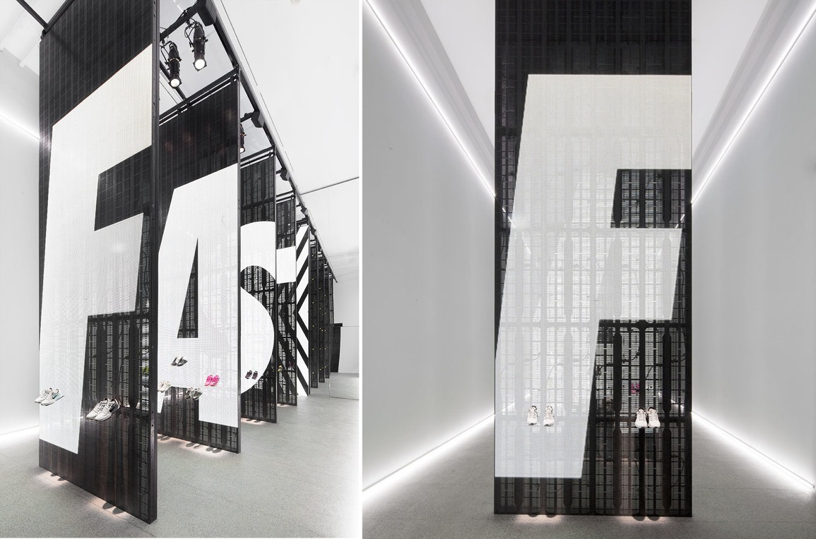
Transforming an art gallery into a temporary Nike Studio, Co-ordination Asia showcased how exhibitors can use dynamic graphics in combination to create a stunning environment.
The space itself is incredibly simple, relying on the instantly recognisable brand typography and colours to identify the company. However, the use of lighting is particularly clever on two levels.
The first is the moving graphics behind each display. Using dynamic LED panels, each display has been programmed to include messages that also result in a visual effect across all five panels. This is particularly effective when it comes to updating the graphics, as each panel can either work in combination or act as a standalone promotional display.
The second (and more subtle) application is the high powered spotlights shining down the face of the moving displays. These catch the silhouette of the shoes which have been mounted onto the display, creating footprints at the base. Although it’s a simple method of illuminating products, the effect created instantly catches the eye.
Tom Dixon
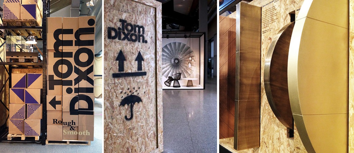
The king of material design (Tom Dixon) created a fascinating exhibition space at Milan Design Week utilising different textures and unusual materials. What we particularly liked about Tom’s approach, is the signage surrounding the area created to catch the eye of designers visiting Milan.
A brilliantly simple display comprising of cardboard boxes that were printed with Tom Dixon’s logo greeted visitors, pointing them in the way of the full exhibition space. This shows that sometimes complex graphics aren’t necessary, and putting everyday objects to a new use can be equally eye-catching.
Continuing with this theme, once in the exhibition space, materials such as chipboard with spray-painted logos directed visitors around the stand, with simple graphics illustrating the difference in product zones.
SET Architects
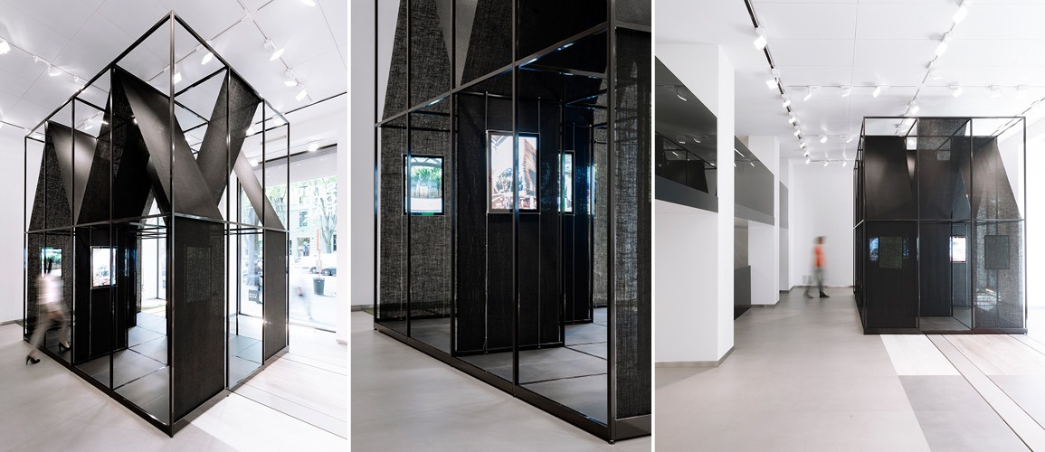
Our final example of interesting material use comes from SET architects, who created a modular pop-up stand, with translucent materials integrated into the framework itself, creating the illusion of private areas without the framework to support it.
A thin gauge framework was used to create the freestanding structure, which was separated into two levels, with the bottom level used to accommodate messaging and screens, and the upper level used to create shapes and introduce lighting.
The use of biodegradable jute black cloth meant that it was incredibly easy to manipulate once the structure was built, whilst providing enough strength with a slight translucency to catch the eye and ensure passers-by could still see the screens within.
Integration
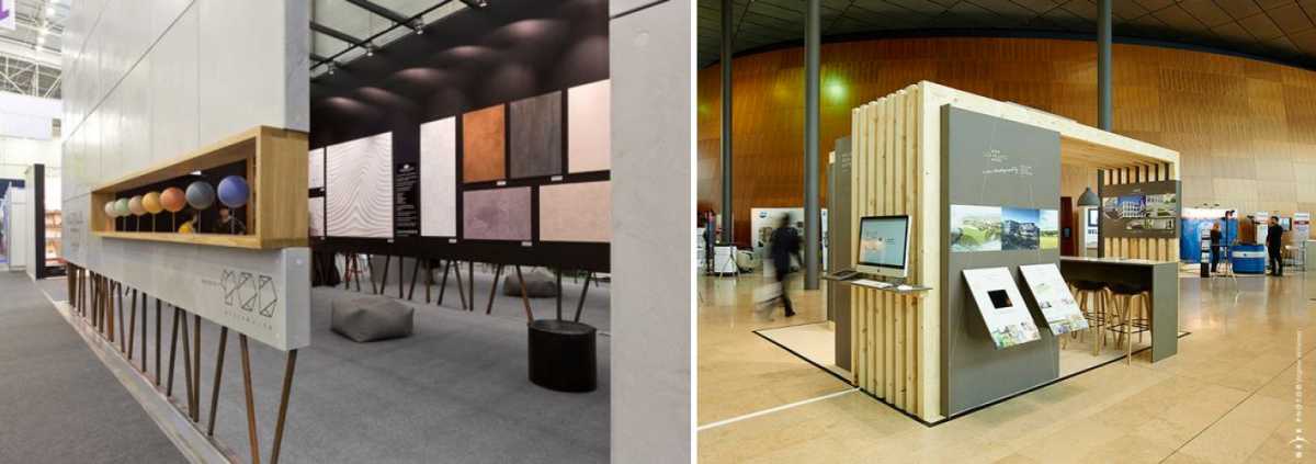
The most straightforward application of wood is to use a ‘framing’ principle, using the finish to surround your stand or product that creates a difference in textures, catching the eye.
The first example is a small-scale use of a wood finish without a backdrop behind, integrated into the side panel of an exhibition stand. This is a clever isolated use, especially considering the concrete finish that the display has been integrated into.
The same concept is applied to our second example, which integrated a wood finish on a larger scale surrounding the stand. This method frames the stand, and provides the visitor with a focal point towards the inside of the stand, meaning visitors are more likely to approach the stand or engage with the artwork on display.
Display

Wood, in isolation, is rarely used as a design feature in a method more than full sheet panels. This is a truly inspiring stand design using sections of pallet-style wood panels, mounted onto the white exterior of the stand itself.
The direction of each wooden panel has been carefully designed to accommodate the logo and graphic treatments throughout the display, especially on the larger elements of the stand walls. However, in contrast, the finish provides a brilliant concept for the smaller panels, designed to create some privacy in seated areas.
This design shows that integrating wood finishes onto displays doesn’t need to be overly complex, and can be simply applied to pre-existing structures.
Pallets
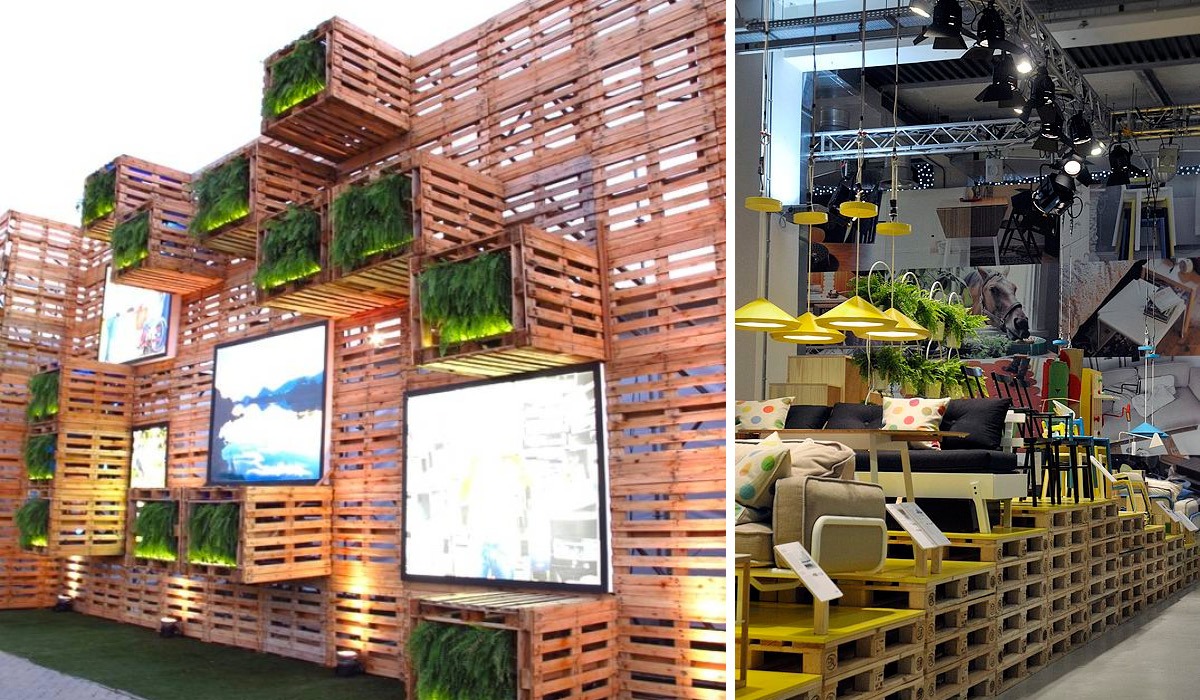
A more direct route to approach utilising wood finishes, Pallets are the definition of authentic design, which are again becoming more prominent in exhibition design.
To highlight what’s possible using Pallets, we’ve seen a concept that applies a solid colour to the top of the pallet, to tie in with branding or the products displayed. This results in a more premium finish to the pallet, combining the original authentic element of the finish, with a higher quality treatment that produces a contemporary display.
Our final example showcases how pallets can be used to create a structure, rather than being stacked for product display. Although we’re sure this is mounted to a more stable backdrop (we hope!), the pallets protrude from the display, creating a multi-depth display, which when combined with screens & graphic displays makes a bright, spacious exhibition space.
Framing
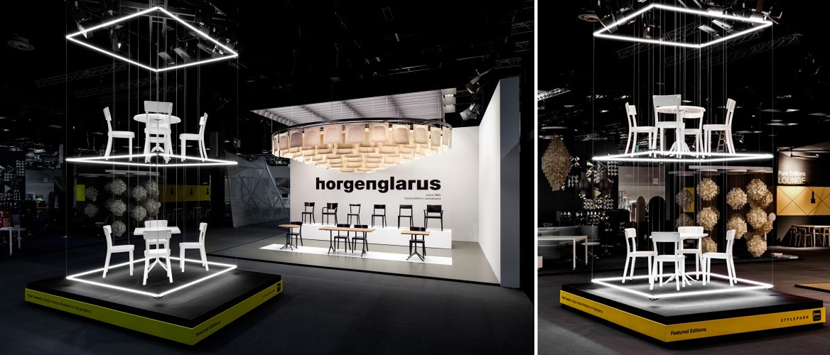
The first, most common use for neon (outside of signage), is as a framing tool. Its natural glow attracts the eye and can be used incredibly effectively as a surround for product displays and high profile items. We came across the ‘Time Tunnel’, which utilises a standalone display area and horizontally suspended neon squares to surround featured products. The brilliance of this display is that due to the glow of the neon, a virtual floor & ceiling is created, giving the floating effect that is the natural draw of the display.
Used in a more direct way (and on a much grander scale!), the “Astronomy Domine” installation surrounds Henri VI’s statue, providing a direct source of light and a framing tool to attract attention. Used on a smaller scale, this application of neon would work incredibly well, especially in an event space where there are multiple visual cues at any one point, so creating a product surround of high-intensity light would be a welcome focal point.
Standalone displays
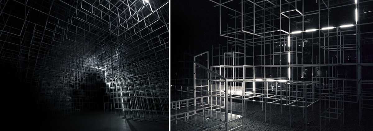
One of the most inspirational events we’ve seen features neon-style linear lighting integrated into a modular framework, for the “Serpentine Pavilion Intervention”. An incredible structure was created on a huge scale, with different level heights for each cube section.
The clever part of this display comes in two parts; the integration of the lighting & the programmed effects. The lighting is integrated into the channel of each profile throughout the structure, which when viewed in context from a distance displays a large glow, giving a ‘lightning’ effect. Programming the lighting itself doesn’t present a great challenge, however creating the effects is more complex, which results in an amazing linear display.
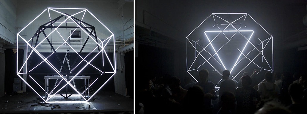
The second display takes a much more simplistic approach, with equally breathtaking results. Creating two spheres, one mounted within the other, results in a display with multiple depths. Especially when combined with higher-level lighting on the inner sphere, allows the user to configure different variations of the display.
This type of display is perfect for event environments, especially where space is at a premium. In addition to this, complex lighting displays attract a high amount of sharing via social media and other channels, which is a key indicator for performance at exhibitions nowadays.
Display
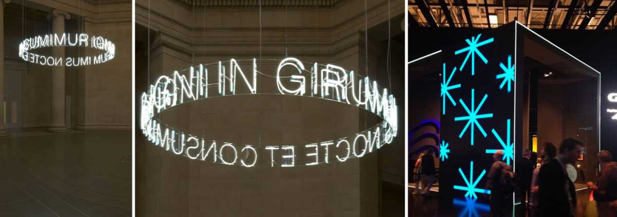
Perhaps the most common use of neon, especially currently at exhibitions and events, is as signage or promotional tool. We rarely see neon in any other setting than wall-mounted, and our first example challenges this.
Created for the Tate, this is a curved, ceiling hung neon display spelling out “In Girum Imus Nocte et Consumimur Igni”. Neon used in this way looks brilliant and has been produced using simple ceiling hung wire cables, four of which carry electrical power. Although using traditional neon might present a challenge, the new LED derivatives are much easier to control, with the capability of being manipulated into different shapes, as well as mounted into a huge range of custom boxes/back panels/even simply displayed alone.
Our final example combines a framing effect as we discussed earlier, clearly marking the entrance to the exhibition stand, and displays integrated into the side of the exhibition stand. Simple linear illumination can be used around the perimeter of the stand, however, the display to the side is more complex, with the illumination mounted within the wall itself. This is something that can only be created with the new variation of neon, with a coated acrylic panel integrated into a backlit display.
Airbus
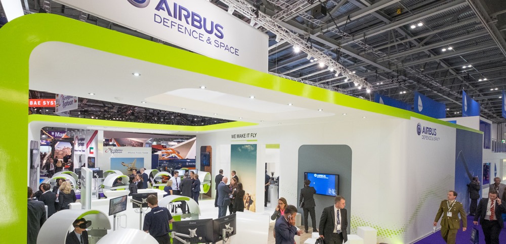
The first stand we look at is the Airbus stand at the Defence and Security Exhibition. The exhibition itself is aimed at top-level military personnel, and major procurement officials – and while we’re not saying this exhibition shouldn’t be interesting, it definitely serves a functional service, rather than providing inspiration.
Airbus decided to challenge this, by creating their entire stand around a virtual reality playground. They introduced individual pods, with mounted sound bars integrating into Oculus Rift headsets, that immersed viewers in three different airspace environments.
Using VR had two benefits for Airbus. One is the fact that many of their parts and equipment would potentially fill the entire exhibition hall, therefore using VR meant they could introduce/demo pieces of kit without the logistical headache. The second is the more obvious benefit, in that it created an engaging experience that naturally attracted visitors to the stand by word of mouth. Introducing multiple pods rather than one or two meant participation didn’t feel awkward, as sometimes introducing new technology that people aren’t used to interacting with causes some discomfort…
Siemens
Siemens took things one step further, creating an exhibition stand that contained a custom VR solution. However, how they translated that to visitors to the exhibition stand was really interesting.
Rather than relying on the headsets/word of mouth itself to pass around the exhibition, there were screens that live-streamed users interacting with the software, which worked well for both creating an attention-grabbing graphic, and breaking down the barrier of the unknown – so visitors wanted to try the system themselves now they know what happens throughout the experience.
Dock10

Our Marketing team witnessed Dock10’s use of VR first hand, at the Prolific North exhibition. Dock10 are a media studio based in Media City, offering post & content platform production. Before the exhibition, they partnered with ‘The Voice’ to use a 4K multi-rig in the studio, which captured the show from every angle.
Dock10 showcased this technology at Prolific North, an exhibition targeted towards content & marketing professionals. Making the most of their limited stand space, they kept the stand design itself simple, with branded graphics surrounding the technology.
This shows the extent of how VR can engage passers-by, with visitors simply having to be wearing the headset for interest to be generated. For companies exhibiting in small exhibition spaces, introducing leading technology such as this, with relevant content, can create more exposure than having larger stand space!
Unibox VR Experiment
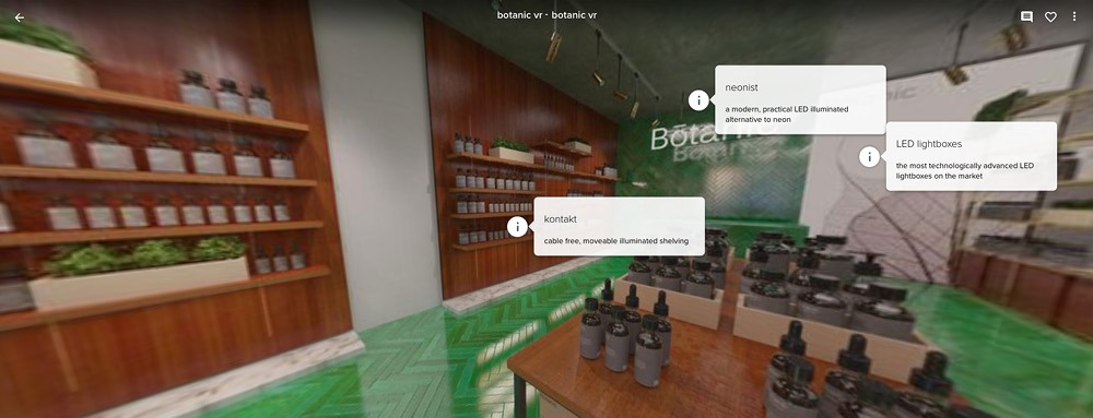
Although arguably less complex than the system Siemens have created (don’t tell our Head of Creative – Duncan I said that!), we created a VR-style shop that contained more information on our products, and how they apply to the areas they’re situated in.
We see this as a stepping stone for clients, as this doesn’t involve the expense of developing your own system, and it can run on anybody’s phone or computer. Similar to the way Siemens added interaction points to their system, adding in simple calls to action such as the ‘i’ button naturally draws people towards that area of the store.
Bear in mind – this was a test environment, to see how the software worked, but it’s interesting nonetheless.
This looks brilliant on an iPhone (and other screens too!), see the experiment here: https://roundme.com/tour/33053/view/79764/
Reggiani
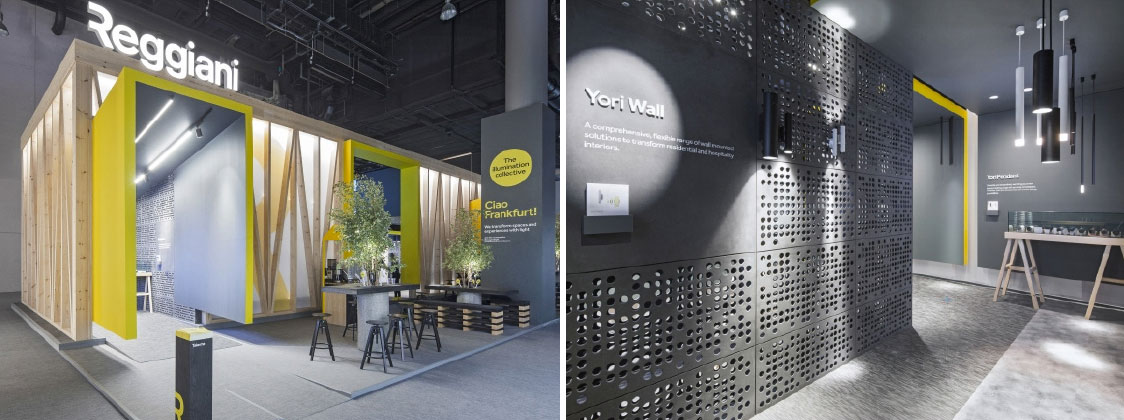
Reggiani launched their new brand earlier this year, with renowned design agency Dalziel & Pow creating the perfect platform for their first exhibition stand. The use of illuminated signage mounted onto the top of their stand space ensured the new logo was visible from all areas, with brand colours used subtly in the archways of each entrance to the stand.
Learn how to create brand-specific illuminated LED signage here.
Perspex
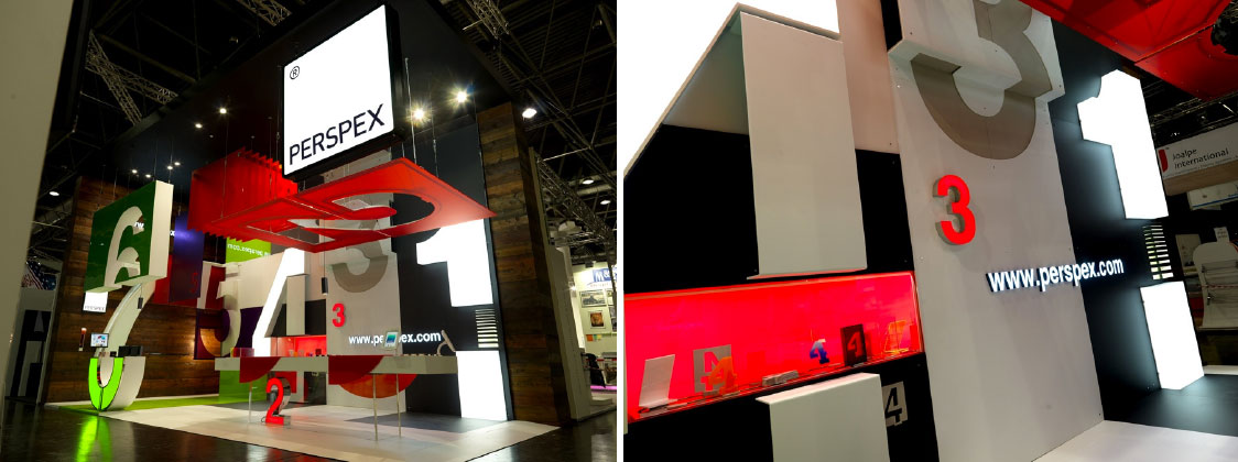
Perspex took a similar approach when creating their exhibition stand, using their own products to design a brilliantly complex display. Taking advantage of the height available, a clear brand message is applied, with the company’s logo taking full focus. Once visitors have approached the stand, Perspex use acrylic sheets machined to form different numbers to differentiate their offering. We love how they used lighting in moderation, which drew attention to important elements of the stand i.e. an enquiry desk, branding and product demos, in addition to how displays have been created both vertically and horizontally, adding an extra level of depth to the stand.
Learn more about how to create illuminated displays and lightboxes here.
G-Star B&&B Trend Event
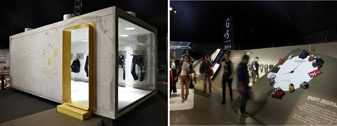
Finally, G Star chose Bread & Butter to create an unforgettable experience for a retail brand, using a range of natural materials to complement their latest collection. With this being a launch of new products, without these products actually being on sale, G Star had to create an experience that seamlessly translated to retail stores once visitors had left the show. Using materials that are ever-present in G Star stores worldwide, such as unfinished concrete, bright white lighting, and cold metalwork, visitors were able to make the comparison between product areas and experiential zones, such as the outdoor timeline.
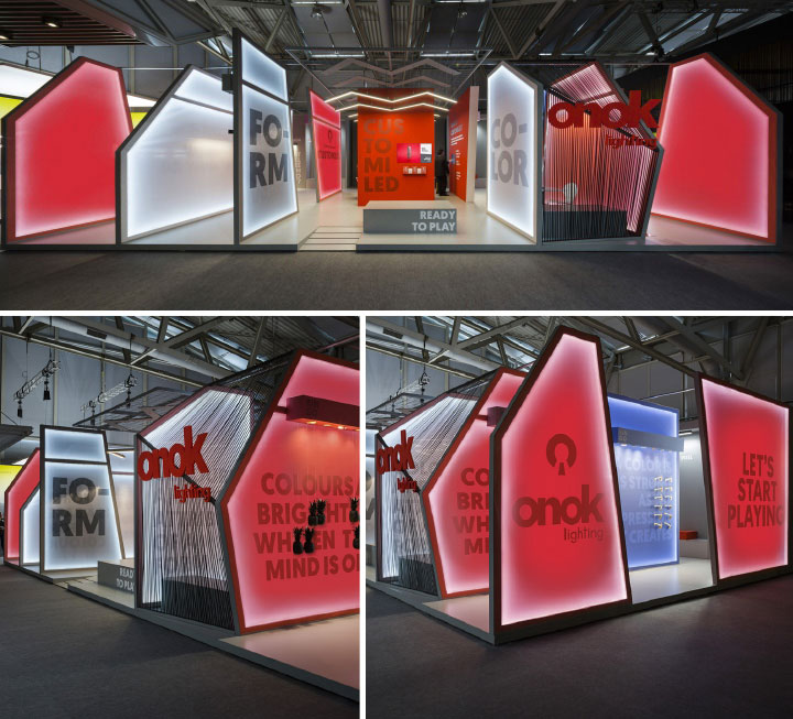
One of our favourite uses of light on an exhibition stand comes from Onok Lighting – so judging by the name, they should be pretty good. The outer walls of their exhibition stand show vivid colours depending on which angle you’re looking, with red, white and blue panels. Each panel is mounted in a frame that contains a thin strip of LED light, illuminating the edges of the panel, demonstrating how colour can shift across large areas.
Inside the stand, Onok uses two different coloured panels, red and blue, to show the ambient effect of background colours on illuminated product displays. We also like how Onok has used different transparencies of infill panels, meaning some panels become opaque as the light travels through.
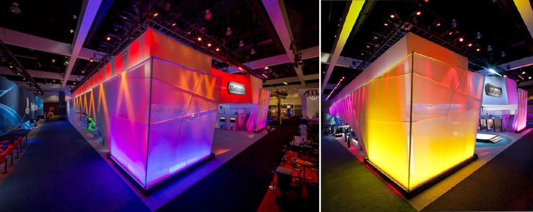
Taking a similar approach to Onok, Nintendo surrounded their stand in fabric and applied light at both the top and bottom. Nintendo cleverly applied different optics to each bank of LED lighting: The lighting at the bottom of the fabric creates a wall-wash effect – spreading the direction of light evenly over the surface, which looks incredibly effective when you see the range of colours Nintendo used around the perimeter of the display.
The second use of lighting can be seen around the top edge of the fabrics, with a narrower optic applied that creates the stripe effect, concentrating a single beam of red light at an angle across the yellow light. This is a simple way to make an exhibition or event display stand out, with the original surrounding white fabric brought to life with LED lighting.

Burkhardt Leitner’s exhibition space not only looks stunning but creates a sense of light without having many points of illumination. Large spotlights are used along with the ceiling of the display, but the use of materials and colour allows the light to reflect around the stand. This looks particularly effective when thin fabric substrates are used, as visitors can see a glimpse of the stand without having to go inside.
This still allows the exhibitor to brand the space, but in a more minimalist way, enticing visitors without shouting for attention, which may be a welcome change from busy exhibition halls. This effect isn’t a difficult look to achieve either – with simple white fabrics attached to a graphic display system, the illumination will create the rest of the look.
Square / 3D Hanging Displays
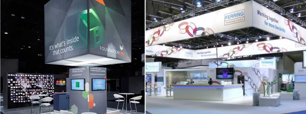
This first example showcases how the banner itself can form the majority of the stand design, with the remaining space used minimally to create a meeting area. Utilising a lightweight frame, and 3D fabric graphics, the display has graphics covering 5 sides, providing complete visual coverage even when on the stand (usually using systems like this, the underside of the display doesn’t contain a graphic). Using a system like this helps save on stand design costs, allowing the graphic to do the majority of the branding & awareness work.
Our second example shows a more subtle use of fabric display, with a narrower strip surrounding the stand space, used as higher-level branding to entice people to the stand. Once visitors get there, screens and other displays are used to sell the products & services, but also having a ‘reception’ style desk makes them more approachable.
Learn how to create ceiling-hung exhibition graphic displays
Curved hanging banners
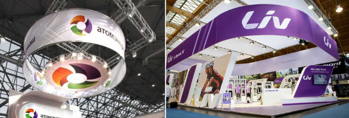
A more simple, yet incredibly effective display method – circular hanging banners are perfect for smaller stand spaces, or for more crowded exhibitions where exhibitors are tightly packed together. Again using a tension fabric system, graphics are applied to a custom radius display that is hung from the ceiling.
As these systems are traditionally lightweight, due to the profile housing the graphics being simple & slim, the display is easy to put together and will comply with any restrictions exhibition halls may have on ceiling loading weights. Print technology has also progressed significantly, meaning the reverse of graphics doesn’t need to be seen on the inside of the banner, using blackout graphics – or you can use a double-sided variation to create two different graphic treatments, without adding a significant amount of weight to the display.
Learn how to create curved exhibition graphic displays
Source: https://www.pinterest.co.uk/pin/479422322817340675/
Illuminated Displays
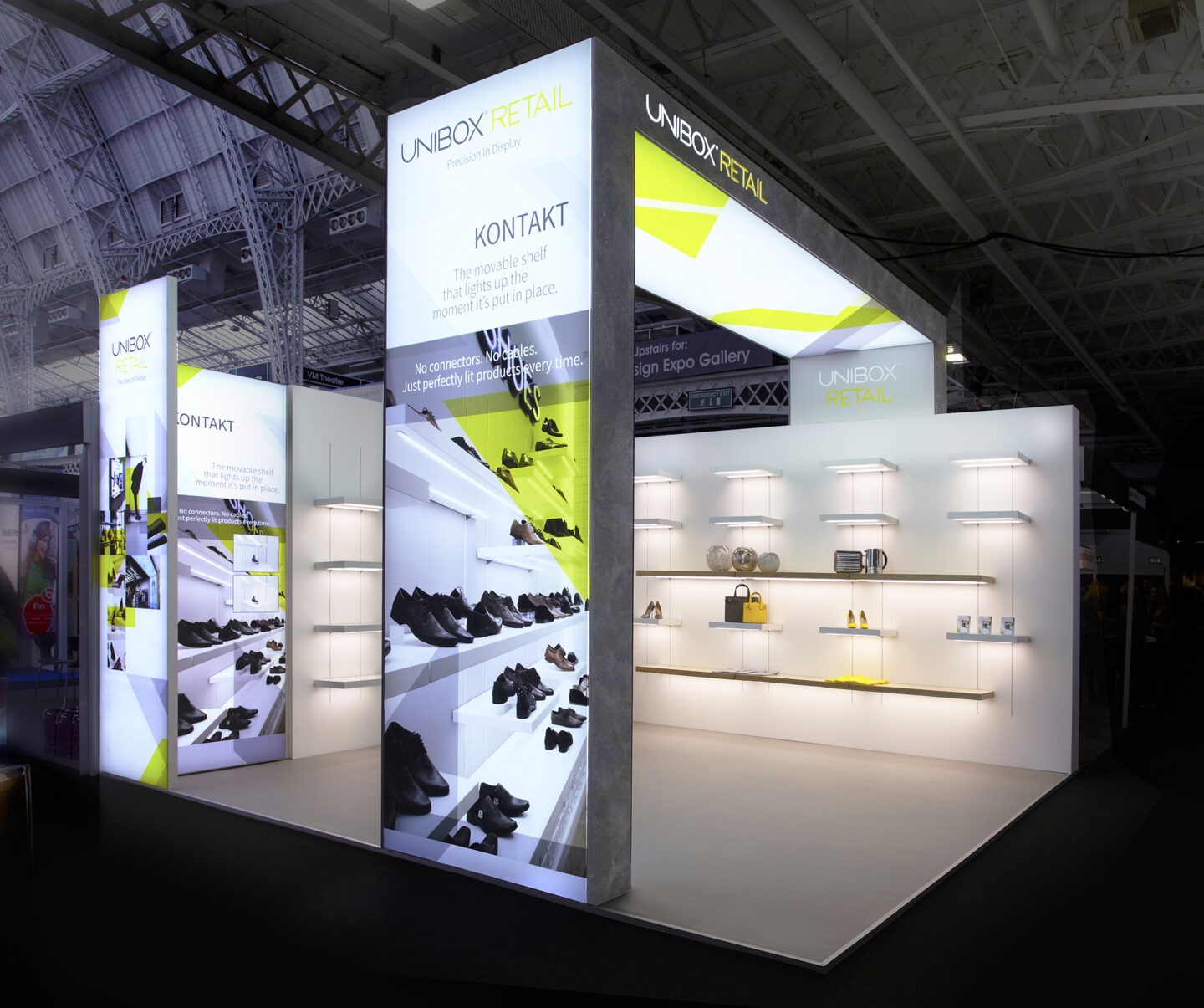

Bayer has used three illuminated lightbox displays to frame their exhibition stand, creating an open feel whilst providing highly visible signage that utilises Bayer’s branding and is an additional lighting source. We used LED Lightboxes to a similar effect at the Retail Design Expo in 2015, which created a column at either end of the exhibition space whilst informing passers-by of our products.
Used horizontally, lightboxes attract more attention due to the majority of ceiling hung displays being non-illuminated, which when combined with custom printed graphics on both horizontal and vertical displays, creates a highly visible stand.
LED Lightboxes are perfect awareness-raising displays, especially when used on a large scale. With interchangeable graphics, a huge benefit comes from reusing these displays for different shows or promoting different products.
Learn how to create illuminated exhibition graphic displays
Source: https://www.pinterest.co.uk/pin/560205641126020482/


