
How does colour temperature affect lightboxes and graphic displays?
With LED lighting now mainstream in commercial and residential environments, most people know about the effect varying colour temperatures can create.
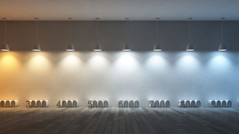
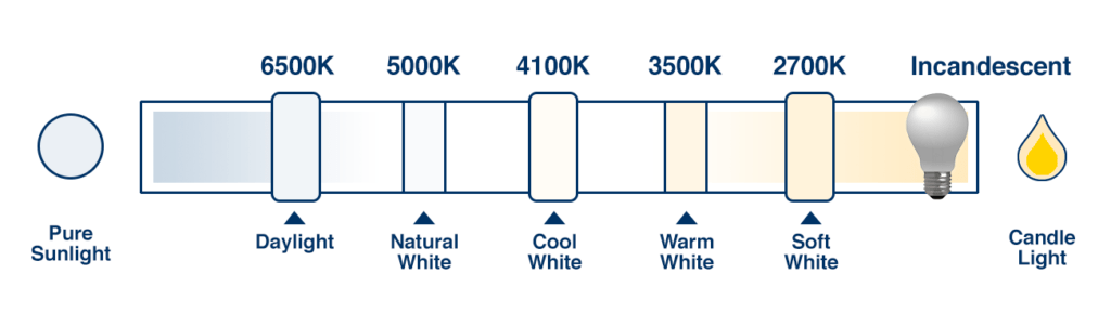
In essence, the colour temperature (measured in degrees Kelvin) is responsible for changing the appearance of the light that is emitted from a diode. LEDs with lower colour temperatures, usually around 3000K, emit light that appears to be warmer (with more yellow and orange tones) whilst LEDs with higher colour temperatures, usually between 6000-7000K, emit light that appears to be cooler (with more blue and white tones).
Lighting designers working in and around the retail sector have been aware of the importance of managing colour temperature for many years, as light plays a key role in determining consumer psychology and shopping behaviours. They are well-versed in using LED lighting systems that emit light of a certain colour temperature to create the desired atmosphere within a store so that it reflects a brand’s identity and appeals to its target market.
The majority of retailers also use illuminated graphic displays throughout their stores as they are proven to be a highly effective way of attracting attention to key products and promotions. In spite of this, though, the impact of the illuminated elements of these displays is often overlooked in favour of the printed fabric or acrylic graphics.
Whilst the graphics are important, so too are the lights that are used to illuminate them, with the colour temperature and colour rendering index (CRI) of the LEDs having a huge impact on how effective the graphics themselves actually are.
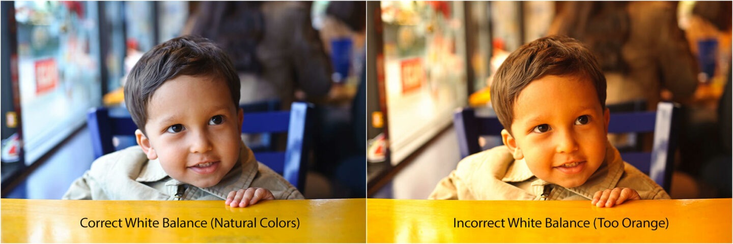
Let’s think of this in terms of photography. To compensate for any surrounding light that could have affected their images, photographers adjust the white balance of their cameras to correct the colour temperature of landscapes, objects and people. If there isn’t enough natural light, photographs can appear over-saturated or have an orange tint. By managing the white balance of an image we are able to see it in its natural, most accurate colours.
The same effect can be seen in LED Lightboxes and the graphics that they’re illuminating. The LED lighting that sits behind the graphic can change the appeal of the image, and more importantly, can sometimes alter the appearance of products that are on display. Fpr example, if a lightbox is illuminated using ‘warm’ LEDs the the printed graphics will appear to be more yellow or orange than they are perhaps intended to. Conversely, if a lightbox is engineered to operate using ‘cool’ LEDs then the graphics will appear more blue than they should.
This is demonstrated in the images below. We worked with Samsung on the development of custom Kinetik lightboxes for its concession inside Selfridges in London. Samsung wanted to display two different illuminated graphics – one blue and the other orange – to create a visually exciting brand environment that would catch the attention of shoppers.
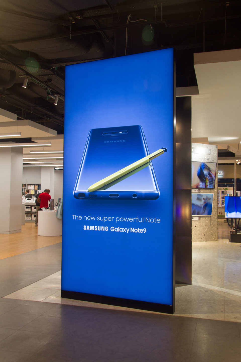
We advised that using the same LEDs in both lightboxes wouldn’t necessarily be the best choice, as warmer LEDs would alter the appearance of the blue graphic and the cooler LEDs would alter the appearance of the orange graphic.
Ultimately, there is no right or wrong when it comes to the colour temperature of the LEDs that are specified for use in graphic lightboxes. Rather, the colour temperature should be considered on a case-by-case basis to ensure that custom graphic displays are presented authentically and that brand colour schemes are matched accurately.
If you would like to learn more about how the colour temperature of light can transform your retail space, speak to our team by contacting us here.


 White on Black")

