
Shop Layout and Retail Design Ideas
There are four main shop layout designs and retail space design techniques that crop up time and time again.
These systematic merchandising plans are commonly used by both large and small retailers working to maximise the effectiveness of their product displays, improve customer experience and generate sales.
But, what are the main types of store layouts and which ones are most appropriate for specific retail environments? Keep reading to find out more about each of the four layouts and learn which type is best suited to your store.
Types of Store Layouts
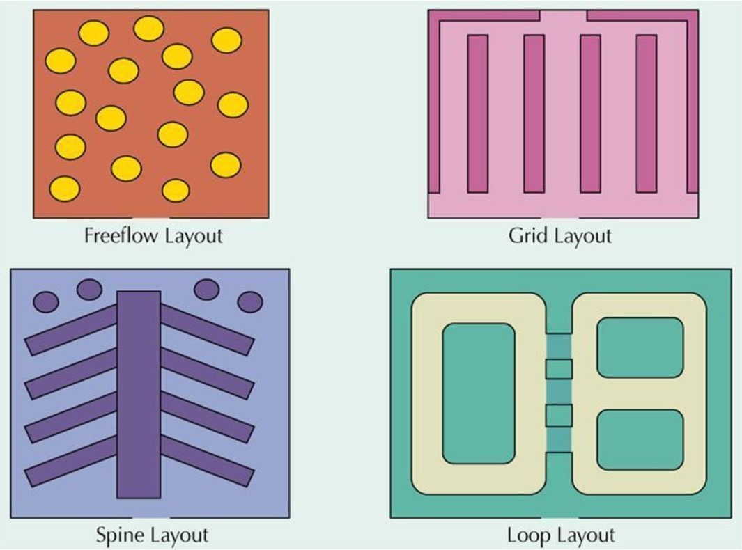
Grid Store Layouts
The grid is the most common type of retail layout, being used by the majority of supermarkets, pharmacies and other retailers needing to display large quantities of merchandise.
As the name suggests, a grid configuration is created by densely packed shelves of related products being arranged in aisles.
The grid layout is the simplest of all the store layouts and enables retailers to use the available floor space in their stores most efficiently. What’s more, given the widespread use of grid layouts, it is easy to source a wide range of shelving systems and shopfitting solutions that are capable of holding large quantities of merchandise.
Modular display systems are ideal for use in grid store layouts as they can be built according to specific aisle lengths and depths and be reconfigured in line with seasonal promotions.
A downside of the grid layout is its highly-structured nature. Stores that use grid layouts sometimes find that they lack the ability to cross-sell and create a branded environment. Now, this may well work perfectly for a store looking to sell a lot of products at a low margin but wouldn’t necessarily be best suited for ‘experiential’ types of stores selling high-value products.
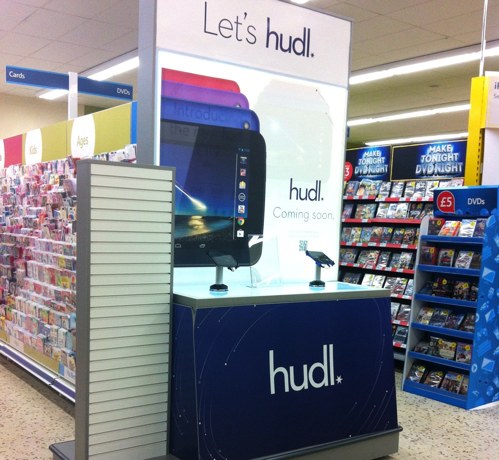
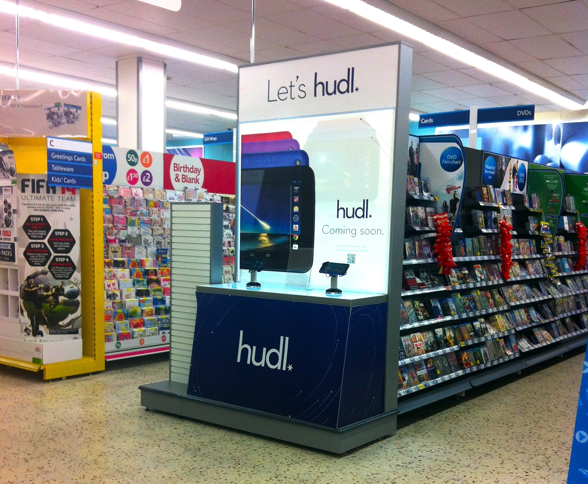
One of the most effective displays that can be integrated into a grid shop layout design is featured product promotions. Tesco, for example, created end-of-aisle displays for the launch of its Hudl tablet that incorporated LED lightboxes with easily changeable graphics and illuminated shelving. These displays ensured the focus was on Tesco’s new Hudl tablet and provided cross-selling opportunities below on the hook display system.
Herringbone Store Layouts
Herringbone layouts are similar to grid layouts but are optimised to meet the needs of smaller retail spaces. Sometimes referred to as spine layouts, herringbone store layouts feature a central aisle that leads directly to the checkout area with a series of parallel aisles on either side.
The herringbone store format is designed to enable retailers to make the best possible use of limited floor space but, as a consequence of merchandise being tightly packed together, product visibility may be compromised.
A way to avoid this and aid customer navigation is by using end-of-aisle displays. As retailers know what type of product the customer will be buying once they enter each zone, targeting them with specific promotions and displays can increase the chances of cross-selling and subtly communicate the products that can be found on the rest of the aisle.
One of the best examples of the herringbone shop layout design is IKEA’s self-service pickup area. Although IKEA stores themselves are known for being massive, the self-service areas adjacent to the checkouts are a maze of towering product displays. The use of a herringbone layout helps the space to feel more open, thanks to a wide, well-lit central aisle.
Active In Style is another example of a small retailer that expertly uses its available merchandising space. Rather than viewing promotions and product displays separately, it used the Magnetik shelving system to combine both. With a large Magnetik display shelf placed at the end of each shelving bay that faces onto the central aisle, customers were drawn deeper into the store and down the individual aisles.
Loop Store Layouts
The loop shop layout design provides a path for customers to take, making their journey more predictable and therefore making promotions easier to place.
Stock levels in loop retail space designs are usually high however the path that surrounds the merchandise is wide enough to provide breathing space and plenty of room for high numbers of customers. This gives them time to browse before entering merchandised areas.
A great example of the loop layout being used is in Selfridges stores. After entering the store and deciding on the direction in which they are going to travel, customers are taken on a guided journey around each of the separate retail concessions and forced to engage with each brand as they pass by. Using the loop format, customers are encouraged to stick to the main concourse until something catches their eye or they find the product they’re looking for.
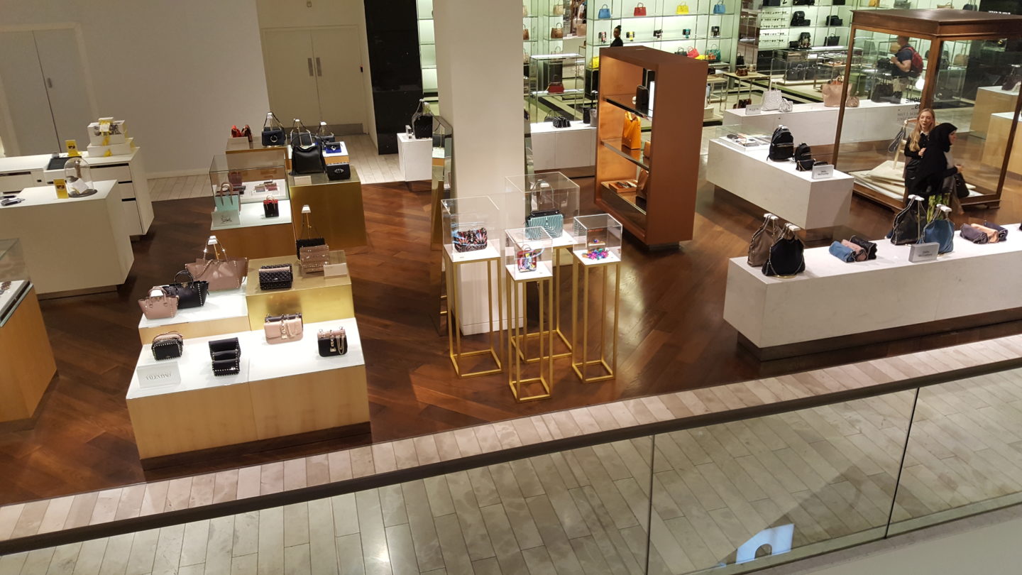
An added benefit of the loop store layout is that it provides excellent opportunities for cross-selling and targeted promotions. Recently, we worked alongside Selfridges to create freestanding handbag displays that face directly onto the main aisle along which customers would travel.
These handbags were high-value items, therefore it was important that the products took full focus. By using a frameless glass enclosure, the visibility of the products wasn’t compromised whilst the custom powder-coated framework below was designed to be unassuming so that customers could see beyond the display should they need to.
Free-Flow Store Layouts
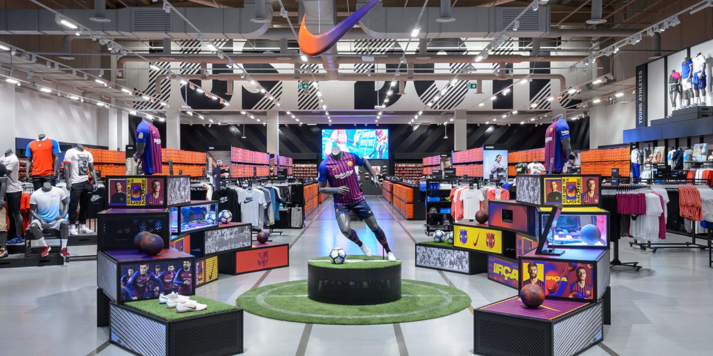
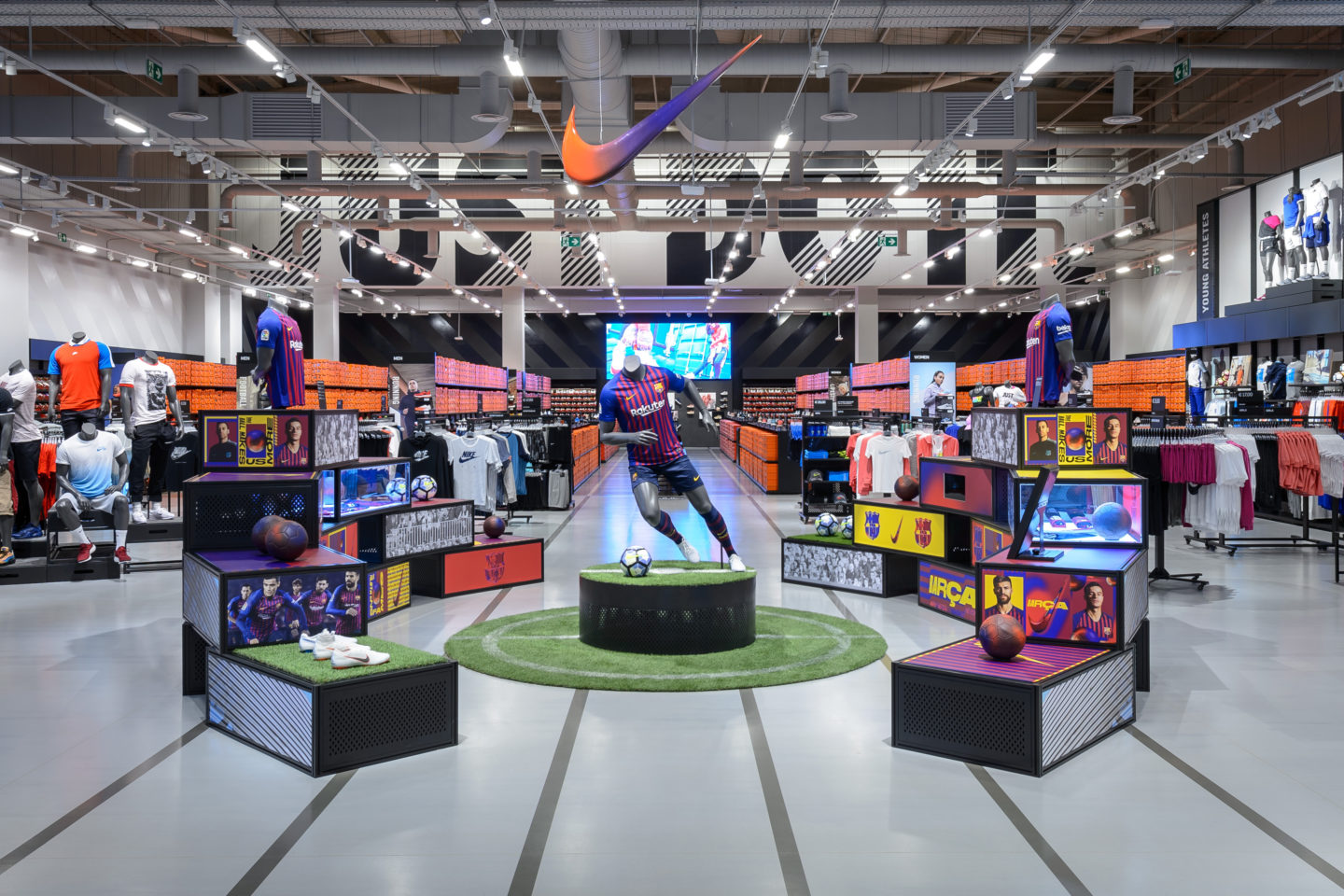
Free-flow shop layout designs are the least structured type of store format. With no set style or organisation, free flow layouts offer the most freedom when it comes to choosing a design that reflects a brand’s identity or supports its product promotions.
Unlike with other store layout designs where the customer’s journey through the store is decided by the configuration of shelves and product displays, the free-flow layout invites the visual merchandising team to guide its shoppers from the entrance, past any key promotions and through to the checkout area.
An important thing to keep in mind when using free flow store layouts is the fact that customers will still begin browsing in the same way as they would in other stores – by turning to the right upon entering the store.
The free-flow approach works well for fashion and homeware retailers that are looking to maximise the opportunities of cross-selling and raising awareness of a larger range of products.
River Island, for example, has launched its new concept store with a free flow nature to the shop layout design. Retail displays are interspersed throughout merchandised areas whilst each area has an overall theme or a method of categorising products.
Our team helped River Island create freestanding illuminated shelving systems and perimeter displays using Kontakt – our cable-free, moveable and illuminated retail shelving solution. By integrating this into a freestanding unit, River Island was able to attract attention with custom LED lighting despite the displays being within the floor section of the footwear area.
Retail Display Specialists
At Unibox, we have over 30 years of experience in working directly alongside an international network of brands, retail design consultants and fit-out contractors to develop store environments that deliver. Our team can offer its insights, capabilities and specialist knowledge to support your business as it works to create retail spaces that are optimised to perform according to the needs of its customers.
If you would like some advice on your next retail display, or to enquire about the manufacture of a custom solution for your stores, feel free to get in touch by contacting us here.


 White on Black")

